Headline typefaces
Naturally, a headline is intended to get a reader’s attention, so they’ll linger on a webpage or a printed page. This is a personal/professional preference: if, and only if, you don’t have a compelling message, you resort to some of the goofy, free font fodder online. Even when you are desperate for a fresh look, there’s only a slight professional excuse for setting a headline, for example, in Arnold Boecklin, an absolutely beautiful typeface I’ve owned for over 20 years, and never used.
All I’m suggesting is some discrimination when you acquire and design. The following are my choice for headline font basics you should serious consider getting.
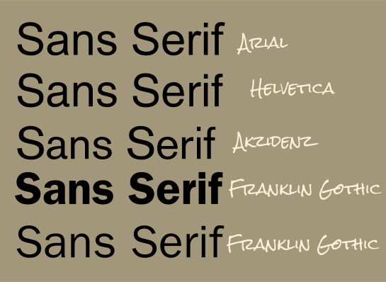
Fonts come into and go out of style; for example, Retro style fonts are making a comeback, but in the early 2000s many designers had become sick of the 50s and early 1960s motif, and went back to a more functional group of plainer typefaces. Helvetica, oddly, is over 40 years old and has never faded completely from use. Helvetica has a bad rap as being uninspired or homely like MS Comic Sans is, but the truth of it is, if Helvetica didn’t serve an important design need, Microsoft wouldn’t have commissioned the Ariel knock-off. Helvetica has its origins in the Swiss typeface movement, and its great grandfather arguably is Akzidenz Grotesk, issued from the Berthold Foundry in 1896.
To a type fanatic (in other words, not you or me!) there is a particular “feeling” when you use Arial, Akzidenz, any Swiss font from Bitstream, or other “Grotesque” family font. Yes, the bowl of a lowercase “e” is less complete in Arial compared to Helvetica. This and other nuances in the character structure do indeed lead to a different message in feel when you use the font in a headline. But if you have no truck with nuance, Use Arial, you already own several members of the family when you bought Windows, and I suggest you get Arial Condensed in all styles because a sans serif typeface truly calls for a Condensed version in different artistic layouts.
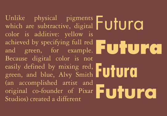
I fell in love with the Futura family in the 1970s when advertising agencies were depending on optical (physical, pre-digital) type. My first glance of Futura in a headline convinced me of its definitive, “Don’t argue with me” presence. This is not to say Futura is only authoritative. It’s quite compatible with hard-edge illustration, many companies mix bold and light to create a novel logo, and Futura Condensed is a really nice alternative to Helvetica when you need to design a technical manual. Futura works very well in a headline with Garamond as body text.
Franklin Gothic is such a classy type family, the Internal Revenue Service here in The States uses it on our tax returns. Franklin is “friendlier” than Helvetica; it has character, while remaining on the authoritative style. If I needed to create a document that says “Listen to me, but I won’t intimidate you”, I’d use the members of the Franklin Gothic family. First designed by Morris Fuller Benton in 1902, “Gothic” as used in the name, simply means today “sans-serif”, without serifs. Benton created many sans serif fonts for newspaper headlines in his days; Franklin remains as his legacy. ITC, Bitstream and other foundries offer their interpretation of Franklin Gothic.
Machine, available in many Bitstream collections and released originally by ITC, is a good “Designer Font” for headlines. In contrast to most of the fonts I’ve covered up to this point, Machine (which comes in a Normal and Bold version) is brash without being too serious about itself. In a way, when you use Machine, the look of the font is so preposterously “top-heavy” that the reader prepares themselves for an important, but entertaining message. Many designers use Machine to imitate the legendary Hollywoodland sign in California, and it’s great for sports headlines, high school football matches, and so on.
Balloon, which has a Light, Normal, and Bold weight that I’ve seen, is more vertical in its use and your need for it, but I can tell you that you should immediately reach for Balloon when you need to create a burst, or make a comment in text, or use as a callout. Balloon was designed by Max Kaufmann—whose also designed the much-imitated Kaufmann typeface—for the American Type Foundry in 1934. Look at the older Nickelodeon logo on TV sometime; Balloon has got some legs. Balloon is just an attention-getter, not for everyday use, but you’d use it as often in design work as you’d use an exclamation point in writing. If you’re over 16 years old.
