


A Tips and Tricks Tutorial By Mike W(“mwenz” on online)
Designing an Elegant Poster
I am a sucker for good design. I seek it out on the web. And I find a lot of it. This (slight) obsession isn’t without its pitfalls—I can become jaded, “unseeing.” When I do stumble across a design that makes me want to replicate it, it is special to me.
I am also a sucker for fonts. Often the odd fonts or redesigns of classic designs compel me to obtain them. Sometimes, in the case of this tutorial, the wanting of the font can be a hard process of tracking it down.
This tutorial combines both of the above peculiarities. I first ran into this poster on another forum where the person was asking about how to create what he described as the drop shadow. It wasn’t a drop shadow at all. It was a blend. While helping the person, I looked around for the font and couldn’t find it. The software I use for finding what a font is did find a font on my system that was similar to it, so I used it instead. And I ended up loving the design of the poster so I also recreated it.Not using the original font began to bug me, though. To cut to the chase, I wound up finding it.
The font used in this tutorial is made by Antonio Rodrigues Jr. and is free for personal and commercial use. You can download the font, London Typeface, used in this tutorial from his web site. Scroll down his fonts page a little and you’ll see the London Typeface section where the download links are. *
* If you are using Interntet explorer, you might have a tough time downloading the typeface, because it’s encoded in the RAR compression format, although browser such as Firefox and others (such as Chrome) have no problem downloading the typeface. If this is a show-stopper, you can download the font from here, a redirected site. Please read the read me file in the zip file and be sure to thank, Rodrigues Jr.!
This poster is a classy design, a wonderfully simple melding of the use of color, type face, design elements and layout. In this version, you’ll make use of a single Named Color and 7 tints of another color—which is from the one Named Color. This single named color can then be changed at will, and all the elements will recolor in their appropriate tints.
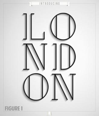
Let’s get started! Figure 1 handsomely illustrates the effect you’ll be making.
Got the Font or a Close Match?
Have you downloaded and installed the font? If not, you can either go grab it now and install it, or use a font you already have. I believe part of what makes this poster rise above the typical poster one can find on the web is the amount of negative space in relation to the subject. A font like the one used in the original is part of what makes this happen. It also contributes to the amount of “shadow” you will see in your result.
The design uses a word that has 6 letters. For your first attempt, I would recommend using either the original’s word, London, or another word with 6 letters. I used the word Oregon in one version I made; which conveniently has 6 letters. Keep it clean, though. This is a family website.
Page Setup—Easy Button Method
-
Open the XAR file you downloaded. The file has the size set (in inches), some layers for organization and a locked guidelines layer.
-
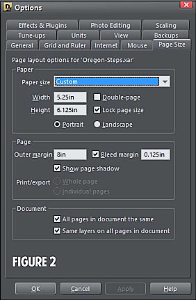
In the Page Options dialog, choose Custom from Paper Size list box. Make it 5.25″ for the width and 6.125″ for the height. Why this size? The image the thread where I first saw the poster was, when imported into Xara Designer Pro, this size at a 100% scale. If you play along with these measurements, it will make later steps a bit easier to follow. See the Options dialog in Figure 2.
Adding the text
-
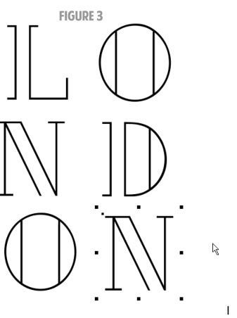
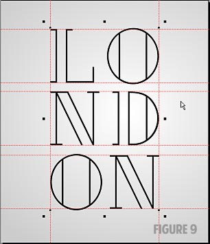
Begin by typing out the word we will be using as individual capital letters. These will be arranged for being centered vertically and for spacing between the “columns.”
-
Type the letter “L” and change it to the font “London” and make it 136 pt.
-
Now hold the right mouse button and drag the letter a little to the right, then let go of the right mouse button.
-
Double-click on the letter, highlight it and type the letter “O”. Do this for the remaining letters. Your art should look like Figure 3 now.
Coloring London
Now it’s time to set the “master” color and name it.
-
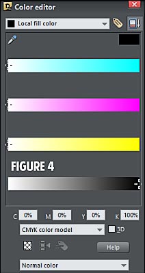
Select all the text and open the Color Editor either by pressing CTRL+E or clicking on the rainbow colored icon to the left of the color line.
-
For our purposes, you’ll use 100% K for the master color. If the Color Editor is not showing the CMYK color model, change it in the drop down list shown in Figure 4.
-
Now, do me a favor. Move the slider for the Black a little to the left then move it back to the right. Why? If the Black is left all the way to the right upon initially changing to CMYK, Xara products capable of producing a PDF will make what shows as 100% Black in the Color Editor actually a “Rich Black” (a mix of all CMYK components).
-
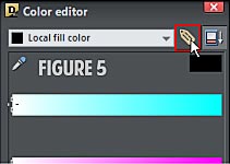
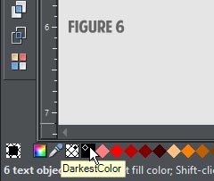
Now press on the Name button; it looks like a tag, see Figure 5.
-
You’ll see a dialog box titled “New named color.” Type the name for this master color. I am using the name “DarkestColor” for this exercise. Once you have typed a name for this color, click on the Create button and this new color should appear to the left of your color line whenever you use a template for a document, like the color in Figure 6.
-
For now move all the text to the pasteboard.
Making Background Layer Art
Let’s move on and create the proper background, oddly enough located on the Background layer…
-
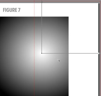
Choose the Fill tool with the rectangle selected. Change the Fill type to Elliptical from the drop-down on the Infobar, and size it similar to Figure 7.
-
I added a vertical guide at the center so you can see the relationship of the offset. The center (Start) point of the elliptical fill is off-center. How much so is not that important. In the example poster, it is centered vertically and horizontally offset to the right just a little bit.
-
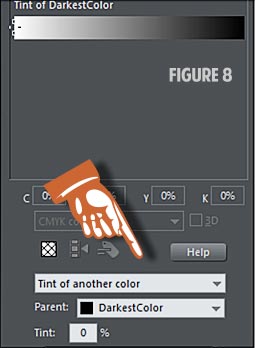
Click on the Local start color (the node at the center of the ellipse). Select the drop down list at the bottom that says Normal color. Change it to Tint of another color. The Named Color should be showing above the single color adjustment bar.
-
Slide it down all the way to the left or type in 0 (zero) for the Tint: percentage. See Figure 7.
-
Now select one of the outer Local end color positions. Again, select Tint of another color from the bottom drop down list. Type 20 in the Tint: percentage input field, then press the Enter key. You should now have a nice gray to white elliptical fill.
-
Using the Page & Layer Gallery, lock the Background Layer.
Tightening Up the Position of the Characters
In the larger sense, the step of arranging design elements like the letters of our poster is a what looks right is right design choice. For our purposes here, though, you have to communicate in order to achieve a design the same or similar to the original. Let’s go for similar.
-
The letters of the original are aligned to the respective columns’ outside. So the letters in the left-hand column are left aligned, the letters in the right-hand column are aligned right. At the size of our poster, the top of the letter “L” begin about 0.70″ down from the top of the poster. Note that the letter “O” sits a bit above and below the top of the letters “L” and “N.”
-
Move a copy of each letter into position so your page looks like Figure 9.
-
Once you are happy with the arrangement, select all the letters. Right-click, and then choose Combine Shapes | Add Shapes (or press CTRL+1). Your letters have been converted to shapes and are nested into two groups. You can (and should) press Ctrl+U to ungroup the grouped group, so you only have one group. Try saying that twice fast.
The Blend
You’re now going to create two copies of the letters, and all three copies will be sitting on top of each other. Then use the Page & Layer Gallery to select each one to offset the bottom copy, to set the tint of each copy and to perform the blend.
-
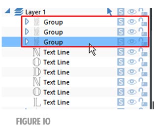
With the group of letters selected, press the CTRL+C keys. Now press CTRL+Shift+V twice. Look at your Page & Layout Gallery. You should see all three groups at the top of the stack as shown in Figure 10.
-
At this point, we need to hide the top copy of the characters. Select the top group and click on the eye icon (visibility) in the Page & Layout Gallery. This will help target the proper copy of characters when you do the blend.
-
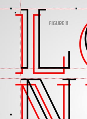
If the bottom Group is not selected, select it. Move or nudge it over (using your arrow keys on your keyboard. You will want it moved about equally left and down. A good way to tell how far left and down is to move downward first, splitting the visual difference between the lower edge of the “L” and the top of the “N” of the second line, then move left so the offset looks equal. In Figure 11, I’ve made the lower copy red for the sole purpose of distinguishing it from the other letters. You do not need to do this.
Using the Named Color
Here’s the part where you’ll see the effect coming together…
-
With the bottom group of characters, bring up the Color Editor if it is not already displayed on your screen. Where it says Normal Color in the list box at the bottom, change it to Tint of another color. The Named Color should already be displayed in the box marked Parent. If not, select it. Type the number 10 into the Tint: percentage box.
-
Select the middle group of characters. Again, change the Normal Color drop down list to be Tint of another color, and then type the number 60 into the Tint: percentage box.
-
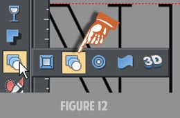
Choose the Blend tool by pressing the letter W on your keyboard or from the fly-out Toolbar, as shown in Figure 12:
-
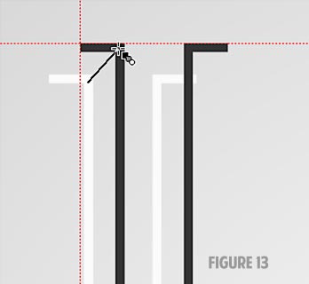
You click and hold on the lower group, and then drag to the upper, as shown in Figure 13.
-
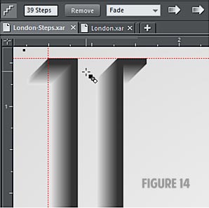
By default, a Blend contains 5 steps. We need to up the number of steps to have a smooth transition. For just screen use, you can get away with a lower number due to the short distance involved as seen on your monitor. For the tutorial, I am using 39 steps, as shown in Figure 14.
-
If you now unhide the top group of characters, you will see the nice clear distinction between the top copy and the darkest part of the blend.
Adding the Design Elements
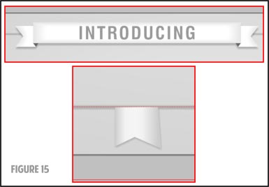
Before you create the ribbon at the top of the poster and the ribbon tail at the bottom of the design, as shown in Figure 15, you’ll want to put a border just to the inside of the poster.
-
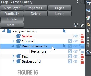
Lock the Text Layer and make the Design Elements layer active using the Page & Layout Gallery. See Figure 16.
-
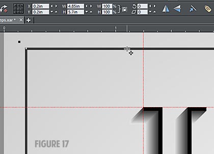
Create a rectangle with no fill and a 2 pt outline. Position it like you see in Figure 17.
-
The dimensions are 4.85″ wide, 5.7″ high. The X/Y coordinates are using the rulers left to right and top to bottom and are 0.2″ from the top of the page and 0.2” in from the left. This size leaves a little larger gap between the bottom of the rectangle and the bottom of the page for the ribbon tail. With the rectangle still selected, use the Convert line to shape command from the Arrange menu.
-
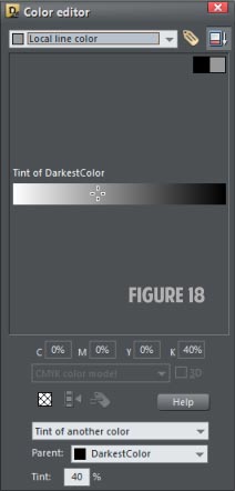
Using the Color Editor, change the line color to Tint of another color and set the percentage to 40%. Make sure to change the drop down at the top to Local line color. See Figure 18.
-
Now, set the Feather to 0.0087in, and select the Transparency tool. Change the transparency type to Stained Glass and a transparency of 60%.
Making the Top Ribbon
To continue the embellishing work, you need to create the top ribbon on the poster.
-
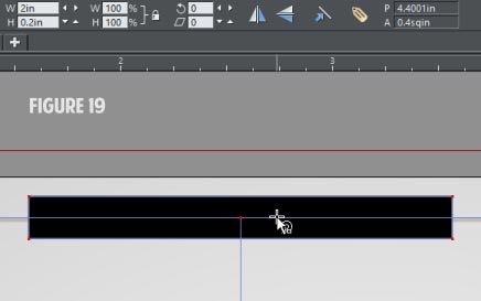
Make a rectangle 2″ wide by 0.2″ high. Center it at the middle of the page and the top of the rectangle you just completed. Figure 19.
-
Make this rectangle a 10% tint of our Named Color.
-
Duplicate this rectangle and position the copy directly over the first one. Make it 0% of the Named Color. Change its dimensions to 1.75″ in width and 0.12″ in height and make sure it is still centered upon the first rectangle.
-
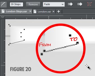
Now blend these two rectangles: choose the Blend tool from the flyout on the Toolbar. Click on a corner of the lower rectangle, and then drag the Blend tool by holding your left mouse button to the nearest corner of the top rectangle. Change the blend to 39 steps, as shown in Figure 20.
The Ribbon Ends
The ribbon needs ticks removed from each side, left and right, to truly look like a traditional ribbon.
-
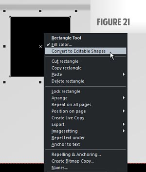
Using the Rectangle tool, create a rectangle that is 0.20″ square near the left edge of our long rectangle you just finished. The easiest way is to just draw a rectangle about the correct size and input the dimensions on the Property Bar. Right-click and change this rectangle to an editable shape using the Convert to editable shapes command near the top of the context menu, or use the Arrange menu (Shift+CTRL+S is the shortcut). See Figure 21.
-
Using the Shape Tool, add a center point on the left edge, halfway top to bottom.
-
Now with the new point selected, drag it straight in about one-third the width of the shape. Look at Figure 22 for this step and Step 2.
p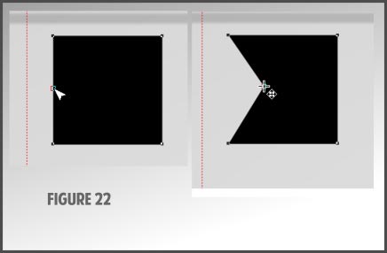
-
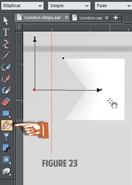
Switch to the Fill tool and drag it on the shape to create a Linear gradient. Change gradient to an Elliptical type on the Infobar drop-down, and then position it like shown in Figure 23, and then change the start and end fills to Local start of 30% of our Named Color, the Local end to 0% of our Named Color.
-
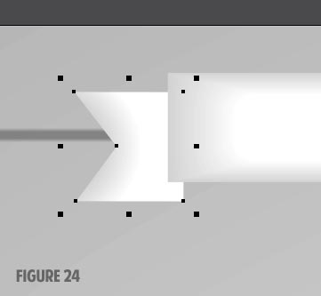
Using the Page & Layout Gallery, move it below the long rectangle blend. Now position it similar to the screen shot. See Figure 24 Being precise here isn’t needed.
Creating the “waft” in the Ribbon
The traditional ribbon element suggests a third dimension at left and right by folding back asnd inward on itself.
-
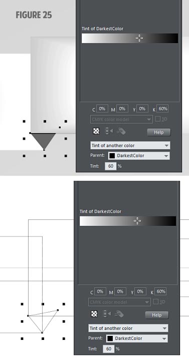
To create the darker-colored “fold” in the ribbon, you use the Shape Editor and draw a triangle, and then move it behind the long rectangle blend and above the ribbon end you just created. Make it have no outline, and the fill to be a 60% tint of our Named Color. See Figure 25.
-
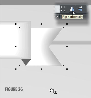
Select the end of the ribbon and the triangle you just created, and then group them together (CTRL+G). With this group selected, hold down the right-mouse button and press CTRL. Drag a copy to the other end of our long rectangle blend. Let go of the mouse button and then click the Flip Horizontally button on the Infobar.
-
Zoom in and position the gray triangle so it meets the lower right corner of the long rectangle blend. See Figure 26.
-
Select all the parts of the ribbon and then group them. Choose the Shadow tool and create a drop shadow that goes straight down just a smidgeon. The position of the shadow should be enough to see it, but not enough for it to distract from the poster’s main subject.
-
Change the Blur value to about 0.0208in.
-
The shadow is going to be black (a rich black). You can opt to leave it this color or you can color it with our Named Color. If you opt to change the drop shadow color to the Named Color, select it, look at what you selected on the Status Bar, zoom in really close and make sure the ribbon is not selected.
-
Click on the Named Color with your left-mouse button and drag it to the drop shadow. You will see a rectangle by the mouse cursor, and it will change to a small square when you reach the shadow. Let go of the left mouse button when it changes to the small square. You will not see any change at this point, but you will if you change the color of the Named Color.
Adding Text to the Ribbon
Any sans serif font can be used, but a non “heavy” looking one will look best, because the viewer’s attention should be on the main text on the poster. I like the font called Impact for a lot of work, but I’d consider it too heavy for this use. Also, if you have a sans serif typeface that’s condensed, it looks best to my eye. You can use either a condensed font, or a regular font that has been converted to curves, and the vertical height increased—you drag the top or bottom control handles, but not a corner handle.
-
In my version, I used Swis721 CN BT, a Bitstream font which is their version of the more commonly named Helvetica Condensed. The. Font size is 12.139 points in my version using the Bitstream typeface. I arrived at this odd point size from visually increasing the size until I liked it in relation to the height of the rectangle. I used the Selector tool and moved a corner selection handle. Use your artistic judgment in the font size ad your choice of typefaces.
-
Tracking, the spacing between each letter of our word, is set to 130. A different font might need a different amount to achieve a similar spacing.
-
With that out of the way, choose the Type tool and then click on the page to create an insertion point.
-
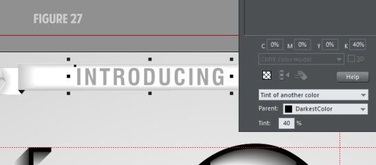
Type the word Introducing. Make it 12 point text for now. Position it on the long rectangle so it is centered vertically and horizontally. Make the color a 40% tint of our Named Color, as shown in Figure 27.
Adding the Bottom Ribbon
This part is an easy one!
-
Move down to the bottom of the page, near the center. Follow the steps for creating the ribbon end, but size it to be 0.22″ wide by 0.20″ high.
-
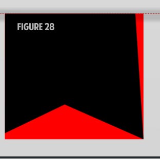
Change the rectangle to an editable shape. The steps to follow will result in a design like that shown in Figure 28. You do not need to copy my version exactly. I’ve placed a red rectangle behind the ribbon end for comparison.
-
Place a new point about in the center of the bottom of the rectangle.
-
Move the new point up and slightly to the left so this ribbon end is not symmetrical.
-
Move the lower left corner point up slightly as well.
-
Move the upper right corner point in slightly.
-
Now you need to color this ribbon end. Using the Fill tool, create a linear gradient from left to right beginning at the left edge to the right edge. Now double-click on the gradient direction indicator (the line between the start and end points), about centered above the bottom center point.
-
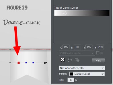
Make the left and right color stops to be a 20% tint of our Named Color. Make the center color stop to be a 5% tint of our Named Color.
-
Add two more color stops to the left and right of the center color stop. Make them both about an 8% tint of our Named Color. See Figure 29.
-
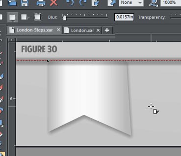
Add a drop shadow to this ribbon end. Again, drag straight down a skosh (“a little”) and set the Blur on the Infobar to 0.0157in. Because this ribbon end is overall a smaller piece than the top ribbon, setting the blur to be a little less than the top ribbon helps it to be almost equally apparent.
Finally, using the Page & Layout Gallery, move this bottom ribbon end to the bottom of this layer. See Figure 30.
Changing the Named Color
Because you kept to using the named color, you now have the flexibility to change the overall color of the entire poster in a few easy steps. Try this:
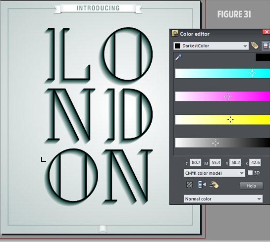
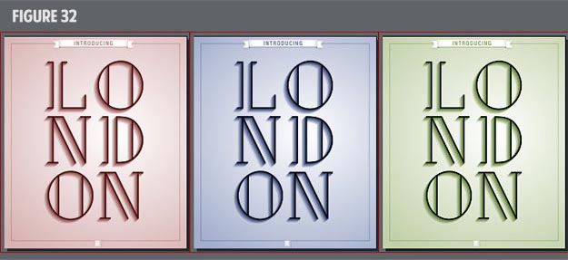
With nothing selected in your poster, open the Color Editor and select the Named Color from the top list. Then move the sliders, as shown in Figure 31. Changing the color or tone on the poster can evoke different moods, can match up or contrast with a different environment. As you can see in Figure 32, a good design can be modified with a simple click-drag to fit the décor and paint color of any room.
Have fun with these techniques and see if you can’t apply them to a solid text design you might have in mind in the future.
Discuss or ask questions about this tutorial in the Xara Xone forum on TalkGraphics.com.

(mwentz on TalkGraphics),has been pushing buttons on computers since 1989. Beginning with writing vertical market software for database publishing, it spread to actually doing the layout and preparing files for the service bureau. Mike has since then been doing layout work for publications from ads to catalogs and loves to get his hands dirty manipulating XML, taming it in the process to something that makes sense on the printed page. Our Guest Tutorial teacher has a love for good design and well-made fonts. He sometimes gets lucky and is able to combine both into a single work.
The tutorial Designing an Elegant Poster including the artwork and the downloadable examples file are Copyright © 2014 Mike W. All Rights Reserved.