

A Tips and Tricks Tutorial By Bob Taylor (“iamtheblues” on tg)
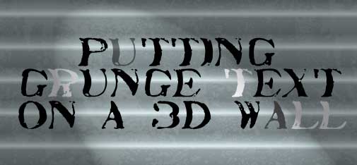
Putting Grunge Text on a 3D Wall
When Gary Bouton offered tutorials this past year on using displacement mapping and warping text to conform the text a specific surface, a lot of us bought into the tutes and we gained some experience in drawing in “3D”, in perspective. And when I offered the camouflage and grunge tutorials in 2012, our membership showed a lot of interest in creating vector grunge.
So I thought I’d merge the two art techniques this month and offer you a method for creating aged text on an aged corrugated metal panel. If you design gaming background, this tutorial will hit the spot; you can add “Beta Shelter 14” on a rusty storm shield on a remote planet. But you’ll see other uses for the technique I’ll cover in a moment, and the key thing to remember is that once you understand what’s going on, you can make many, many variations on the technique to create entirely different looking, but equally visually intricate artwork.
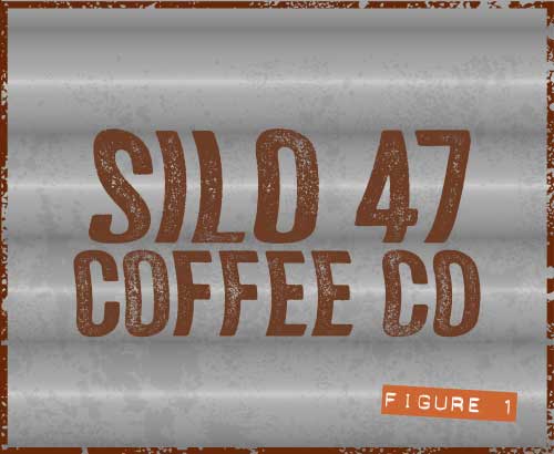
Here’s an image of what’s in store in Figure 1 .
Designing the Background
Let’s begin by building the corrugated metal background:
-
In a new document, choose the Rectangle tool, hold Ctrl to constrain the shape to a square, and then drag until the Infobar tells you the shape is about 800 by 800 pixels. There’s no special significance to the shape’s side—I’d just like us to all be working with the same elements.
-
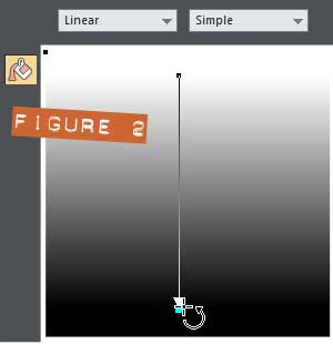
Choose the Fill tool from the Toolbar and then hold Ctrl (to constrain its angle) and then drag from top to bottom above the square. See Figure 2.
-
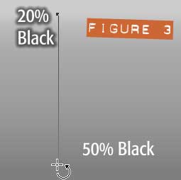
With the Fill tool still selected, click the top color handle of this linear gradient and then click the 20% black swatch on the color line. Then click the bottom color handle and click the 50% black swatch on the color line so the square now looks like that shown in Figure 3.
-
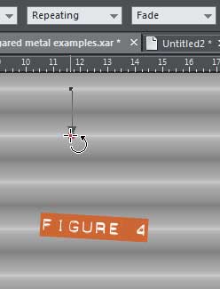
The shape looks absolutely nothing like Figure 1, doesn’t it? You need—while the Fill Tool is active and the square shape is chosen—to choose Repeating from the Fill Tiling drop-down list on the Infobar, as shown in Figure 4.
-
You might want to hold Ctrl now to ensure that you’re dragging the end color handle of the gradient perfectly vertically; click the bottom color handle and then drag upwards until the corrugation design repeats about 6 times or so.
Now, there are at least two ways in Xara to get the corrugated metal background looking more metallic.
-
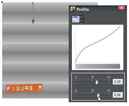
Use the Profile controls you can access when the Fill tool is active. In Figure 5, you can see that when you click the arrow button on the Infobar (when a shape and the Fill tool are selected), you’re provided with a Profile box which operates not all that differently than a Curves or Levels set of controls in an image editing program. The top slider controls the gain—the contrast/brightness of the selected gradient, and the bottom slider controls the bias—whether lighter or darker shades are more predominant. You can do a lot to modify a gradient using the Profile dialog box.
-
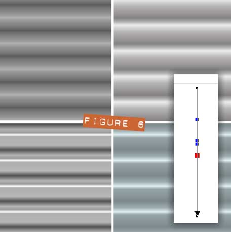
You can use the Repeating Fill tiling box, but instead of adjusting the Profile of the gradient, you can add new color transition points by double-clicking on the gradient line. You assigning a new shade to the new color point, and then move the points around with the Fill tool cursor to create a flat corrugated look, or change the lighting, or do other creative things. Figure 6 shows the Corrugated metal examples.xar file, one of the files in the Zip archive you downloaded. Why not examine how the shapes are filled and get inventive with your own versions?
-
Aging the Metal Background
Although the background looks detailed and appropriate for some text, if the text will be grungy (it will!), then the metal should show some aging, too. What I did to create the Vector grunge file in the Zip archive you downloaded, the begin with, was to scan a used, old section of dropcloth used around the house to catch spilled paint. If you have a used sponge, coffee coaster, worn leather, or papers that have been picking up filth lying around, do what I did and scan them. Then increase the contrast (try the Color Filter>Threshold Live Effect in Xara), and then auto-trace the resulting bitmap.
In any event, I’ve done the work for you <grin>.
-
Open Vector grunge.xar, and then copy the single shape. Close the file.
-
In your design, paste the vector grunge shape.
-
With the Selector tool, place it over the corrugated background shape.
-
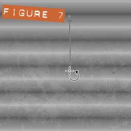
Choose the Transparency tool, and then choose Bleach from the Transparency type drop-down list. As you can see in Figure 7, I’m dragging from top to about the middle of the grunge shape so it fades away at the top of the composition.
-
Select both the grunge shape and your corrugated shape, and then press Q. The grunge is clipped to the metallic background. Nice and neat now.
Adding the Grunge Text
There are a couple of ways to present “distressed” typed text, to display a weathered, “grunge” look. The first way is to get a font that’s already grunged-up. In this example, I used a typeface called Veneer—a group of 8 variations that are/were on sale for $9.00US on MightyDeals. Veneer is a flexible family of fonts that allow variety in the individual letters, so that one can have heavy, medium or light grunge effects so that repetition can be avoided whenever the same characters occur within the design.
If you want to follow along with this to the letter, I have included a version of the lettering converted to editable shapes in the Grunge text.xar file. The text refers to a fictitious coffee warehouse.
Now, the choice of font you use will impact on how you map the font to the background.
-
Place your lettering over the background (clipped square) and size and position it so that the central parts of the letters correspond with the areas of the design that appear to be raised (they have a highlight at the top).
-
If you’re using your own font instead of my Grunge text.xar file’s contents, choose Arrange>Convert to editable shapes (the keyboard shortcut is Ctrl+Shift+S).
-
Press Ctrl+U to ungroup the resulting group of shapes, the press Ctrl+U again to reveal the control points of the text.
-
With the Selector tool, marquee select the first line of text; with my pre-made text, this is the “SILO 4” shapes.
-
Choose the Shape tool now (previous versions label it the Shape Editor tool).
Now it’s obvious with the shapes selected, that the grunge appearance of the font was created using an awful lot of control points. And this is to our advantage here, because you’re going to be somewhat selective (pun intended) about which points you’ll select and move now.
-
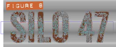
Marquee select the central portions of the letters that are over the lightest area of the background. See Figure 8.
-
Press Ctrl+Shift+O to open Options and make certain that the Nudge size is only 1 pixel or so on the General tab, then click Apply if you need to change the current value, then click OK to dismiss the box.
-
Using the keyboard arrow keys, nudge to the right once or twice.
-
Now with the Selector tool select this line of text and group it (Ctrl+G) again.
-
Repeat this method on any extra lines of lettering you might have in your design.
A simple, yet effective means to distorting text to conform to a shape that appears to be bulging outwards at regular intervals!
Some Advice on Working with “Non-Grungy” Fonts
If you’ve opted to begin this tutorial using a font that doesn’t have a grunge effect (and thus far fewer control points once you Convert it), then you’ll want to use a slightly different method to achieve the effect demonstrated here.
-
With your text selected, choose Arrange>Convert to Editable Shapes (Ctrl+Shift+S), and then press Ctrl+U twice because converted text is a group nested within a group and you want to be able to work with the control points.
-
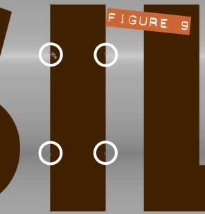
With the Shape tool, you’ll want to add control points where there are none in the middle—the vertical center—of the characters. Curved characters are going to require your artistic judgement as to how many control points you need to add, and characters with straight vertical stems (see Figure 9) are problematic; you’ll want to put control points near the brightest part of the underlying background, and perhaps even make the control point connections smooth. In short, click a point on a character with the Shape tool and a new control point is created. Try dragging a straight line segment to create a curve, and then where you see fit, elect a control point with the Shape tool and then press S (to make a Smooth connection).
-
Marquee select the control points to be nudged, and then map the text to the background as Xaraists who used a grunge typeface did, as described earlier.
Moving selected control points using Xara’s nudge feature provides you with a totally controllable and predictable “grunge” effect once you’ve converted text to simple shapes. Let’s some of your “dirty work” on the Xara Xone forum on TalkGraphics.com!

was born in the middle of the last century. The son of a sharecropper mother and a bootlegger father who both died when he was five years old in a bizarre accident involving a whiskey still and an eleven foot sack, was raised in a home for wayward children on the banks of the Mississippi Delta.
With this background he was destined to become an Emergency Service Controller for British Gas in Bath, Somerset, England. Because he suffered from an undiagnosed affliction later described by physicians as “a real attitude”, he was pensioned off with some relief by his employers, as he was constantly in hot water for shouting at, and roundly abusing customers on the telephone.
He decided to move to Spain and settled in a remote village in the shadows of the foothills of the Alujarra Mountains, not far from Mecina Alfahar. Whilst out walking one day, he found a discarded copy of Xara Xtreme 5, The Official Guide…the rest is history.
The tutorial Putting Grunge Text on a 3D Wall including the artwork and the downloadable examples file are Copyright © 2013 Bob Taylor. All Rights Reserved.