

A Tips and Tricks Tutorial By Gary Bouton (“Gare” on tg)
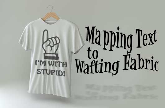
Mapping Text to Wafting Fabric
Perhaps you’ve seen an amateurishly retouched photo with a semi-clever phrase stamped onto a T-shirt. And the obvious giveaway to the photo-phakery is that the text is on a straight line while the T-shirt is at an angle and the fabric is wafting in and out!
This sad and implausible retouching job would have benefited from the artist using Xara Designer, and reading the steps to follow. I’m going to show you how to apply text to a T-shirt that needs ironing, and you’re going to match the curvature of the wavy fabric and even add shading via transparency to the text looks as though it’s on the shirt, and not floating above it.
Download the August Tips and Tricks Zip archive, unpack the contents and then load T-shirt.xar. The image is locked and I’ve provided you with text (I used Impact) all converted to editable shapes and a Stained Glass transparency applied. Use your own text if you like, but it’s a time saver to press Ctrl+Shift+S to convert the text to editable shapes, and then press Ctrl+U (Ungroup) a few times until you can see the control points along the shape. You’ll be distorting, slicing and editing the text, so simplifying it makes operations easier.
Perspective and Slicing
The first thing you want to do is create a perspective with the text that matched the angle of the photograph of the shirt, which is slightly facing the left. See the “Packaging and Perspective” tutorial from last month if you’re not familiar with Xara’s Mould tool modes (http://www.xaraxone.com/tutorials/packaging-and-perspective/).
Then you’re going to see which areas of the shirt fold inward and outward, and moving sliced up areas of the text is the real key to making text that travels in 3 dimensions. If you look at a shirt with something printed on it as it hangs, you’ll notice that the receding text is slightly lower than the baseline of the text, while areas that protrude towards you as the fabric folds outward seems to move upwards slightly. Follow along here:
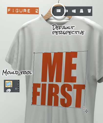
- With the Selector tool, move the text over to the chest area of the shirt, basically centered horizontally. Then choose the Mould tool from the Toolbar.
- Click the Default Perspective button on the Infobar, and then choose the Shape tool from the drawing tools flyout because it’s much easier to edit the Perspective control points with this tool than the Mould tool itself.
- Shape the control points to form a perspective like you see in Figure 2, a rectangle in 3D facing left. Take your time and then save the file to your hard disk.
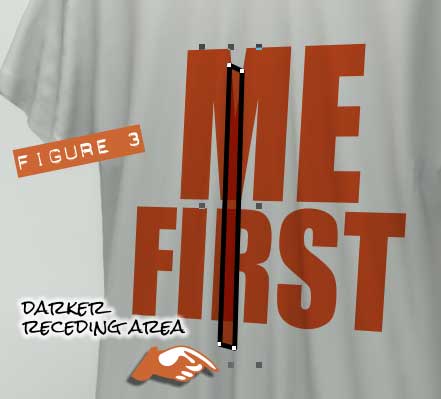
- Examine the image of the T-shirt, and find a darker, receding vertical area, as I’ve outlined in Figure 3. What you want to do is create a shape like you see here using the Shape tool in line and cusp mode (you set these on the Infobar), and when you’re done, get the Selector tool and click on the text. The press Ctrl+C to copy the text (and its attributes) to the Clipboard. Then select the shape you created and press Ctrl+Shift+A to paste only the (transparency and color) attributes to this new shape. By doing this, when you slice the two shapes next, the color and transparency values will remain unchanged.
- Choose Arrange>Slice (Cut) Shapes, the keyboard shortcut is Ctrl+4*. The Status Line tells you that one group is selected, but there is an unselected group on the work: the slice based on the shape you drew in Step 4. With the Selector Tool, select it and move it downwards just a little. The effect is that the fabric of the shirt is wafting away from the view of the composition. Now, because the lines of the shape you drew weren’t parallel, expect some overlaps or gaps between the sliced text part and its new neighbors. The simple solution to closing the gaps is to Ctrl+click on a piece (because the shape is part of a group after the Slice operation) to reveal the control points and then with the Shape tool, move the control points so there is no gap or overlap between the text pieces.
Finessing the Warping Effect
Now that you’ve moved one out of two pieces I detect in this composition, that will make the text conform to the cloth of the shirt, there are other qualities you need to create and enhance. Let’s work with a little recoloring and manual distortion of the text areas now.
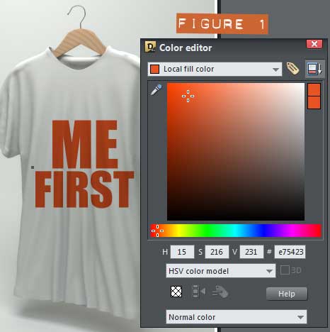
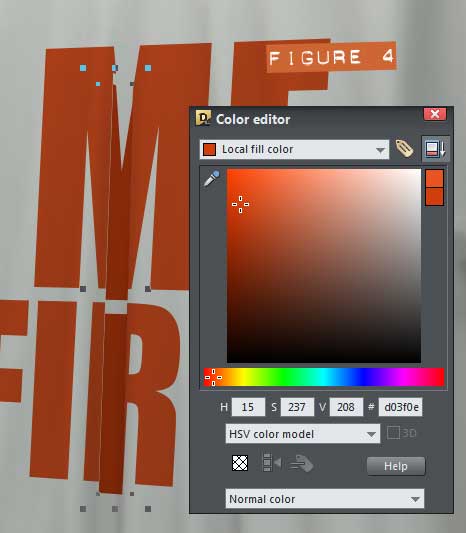
- It’s natural that a part of the text that is in a receding area of the shirt’s fabric is a little darker, a little hidden from the scene’s light source. Select the sliced group of shapes, press Ctrl+E to display the Color Editor and make the piece a little deeper in color, as shown in Figure 4.
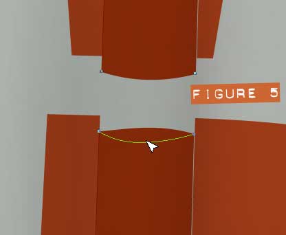
- If you look of a photo of a wrinkled shirt with text on it, the text has no straight lines in it. So you’re going to mess up the text somewhat to first make the receding darker text area curve downward at its horizontal lines, pushing it down in effect, making it look more compatible with the flowing areas of the shirt. Ctrl+click and area such as the bottom of the M or the top of the R to select the single shape and expose it to editing. With the Shape tool, click and then drag the horizontal area downwards, as shown in Figure 5.
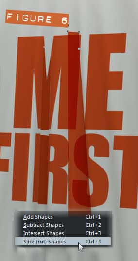
- It’s repeat performance time. Most notably on this shirt is a crease inward down the right of the M in “ME” through the left side of the “S” beneath it. Create a shape that follows the slightly darker area of the shirt, copy the transparency info and then paste its attributes to this new shape, and then select the underlying shape and the shape you just created and then press Ctrl+4, or whatever you like to do the Arrange>Slice Shapes command. See Figure 6.
- Make the red color a little darker, as you did with the first sliced shape.
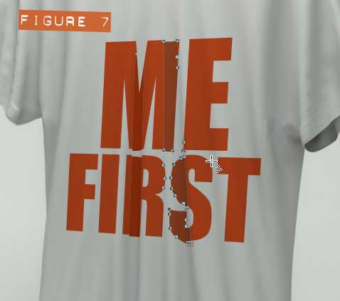
- Move the new slice down a little, and as you did with the first slice, Ctrl+click with the Selector tool to reveal the control points, and line up gaps with the surrounding shapes. Then push the horizontal parts of the sliced text down a little, bow it down using the Shape tool. See Figure 7.
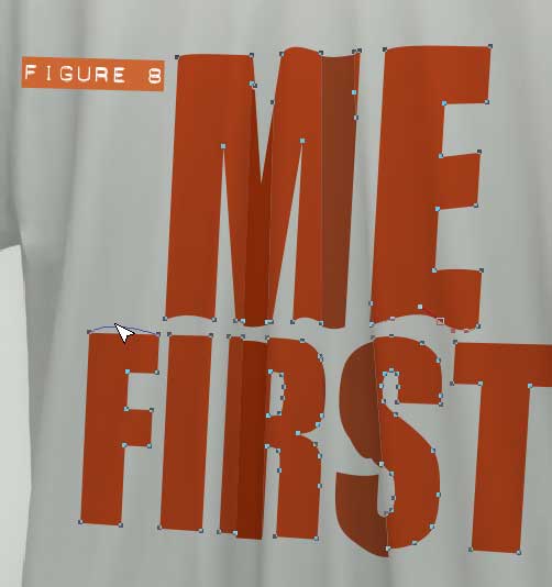
- Okay, the darker two slices have their horizontal components arcing down. Therefore, the protruding areas need to have their horizontal sides arcing upwards a little. Begin by Ctrl+clicking the M. As you can see in Figure 8, which is near completion, the “M” has at least four horizontal areas that can be bent upward a little using the Shape tool. Remember that if there is a straight line in sight within the text, it’s going to look wrong, the effect will fail with the audience.
- For bonus points and to get real fussy about optics and photo-accuracy, consider making the text at left just a little lighter than the text at right because the shirt is strongly lit from the left. You can do this with the Color Editor, or by using Transparency—a linear gradient will work well here and there—with selected shapes.
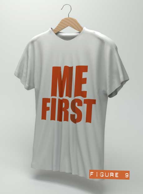
- Figure 9 shows my finished composition. Now, I need to work against deadlines (which I often miss) on The Xara Xone, but you people have all the time in the world to experiment with this text mapping on fabric stuff, so I’d like to see you all out-perform me and post your work on TalkGrapics.com, okay?

has been drawing with traditional tools for almost 40 years, and with digital tools such as Xara for close to 20. As large a fan as he is a practitioner, Gary encourages others to express themselves artistically through his writing, the over 25 books on graphics he’s had published, through the videos and tutorials he creates for The Xara Xone, and through his online school, Exclamations. You can send him some email, visit his personal website, or better yet drop on over to the Xara Xone Forum on TalkGraphics and talk to Gary and the rest of the Xara community.
The tutorial Mapping Text to Wafting Fabric including the artwork and the downloadable examples file are Copyright © 2013 Gary Bouton. All Rights Reserved.