


A Tips and Tricks Tutorial by Frances Proctor (Angelize on TalkGraphics)
Designing a Stained Glass Window
Designing a Stained Glass Window
I’ve been creating and posting stained glass illustrations on TalkGraphics lately, and the response has been so positive I thought I’d share the technique with our community. Now, forget hot solder and sharp glass: I’ll going to show you in Xara how to create a beautiful stained glass window set in a distressed, painted frame, step by step.
Before you get started, there are a few things you are going to need: Download the tutorial starter file and then open it in your Xara program. I use Designer Pro, and that is what you’ll see in the figures to follow, but you should be able to do this in Photo and Graphics Designer.
You’ll see 3 seamless tiling bitmaps, a set of named colours, a rough sketch and a pre-made background in the Xara file. Many of you are already familiar with using Xara’s fractal fills and transparencies to create textures, but in this tutorial you’ll see how to use imported bitmaps in a similar fashion to achieve photorealistic textures.
You’ll notice the sketch at the center of the document is a bitmap—it’s been locked—and it is a very simple (and very rough) drawing. This is your visual resource for the caming, usually copper, pewter, or lead, the lines between the stained glass. The .xar file also has 2 layers; Layer 1 where the line work/caming and the frame will be done, and a second layer underneath where you’ll create the glass panels. Download the file, open it in your version of the Xara design program, and let’s get started…
Creating the Stained Glass
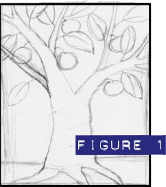 Begin by making sure that Layer 1 is selected and active; open the Page and Layer Gallery (press F10 in Xara Designer) and then click the Layer 1 title to highlight it and make it the current drawing layer. Draw a rectangle over the sketch with a black 6 px outline and no fill (see Figure 1).
- Choose the Shape tool (or the Pen tool), set the line width on the Infobar to 4 px and then trace the sketch. You will need to clean up the sketch as I have done (see Figure 2).
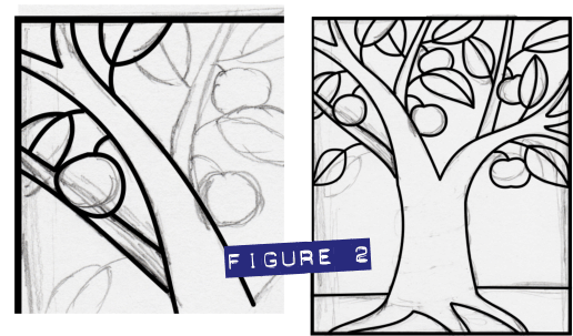
- It’s not necessary to exactly follow the sketch: you’re welcome to draw bananas on the apple tree, and I promise to laugh. In Figure 2 you can see that the bottom leaves on each side were brought down and outward to touch the outer frame.
- Once you are happy with the lines you’ve drawn, select all of them, and then choose Arrange >Convert line to shape. All the lines are now shapes, you will have quite a few of them (I ended up with about 66). With all your shapes still selected use the keyboard shortcut CTRL+1 to Arrange>Combine Shapes>Add Shapes…and the result is a single shape. You can now unlock the sketch by clicking the red lock icon next to it in the Page and Layer gallery, and with this entry highlighted, you can click the Delete button.
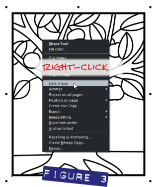 Select the caming lines and then right-click. Choose Lock shape from the context menu. (see Figure 3). The caming lines are now locked in place, making it easier to create the beautiful glass panels. You’ll come back to the caming later. See Figure3).
- Click the Glass layer title on the page and layer gallery, so that you are now working on this layer. What you’re going to do is set a unique default value for the shapes you’re going to create; each one you’ll draw will have the same outline color and transparency value. Make sure nothing is selected (press Esc) and then choose the Transparency tool (the wine glass icon) on the Toolbar. On the Infobar, set the Transparency slider to around 60%. Right-click on a red colour on the colour line and set it as the line colour.
- Use the Shape tool: click to place nodes underneath the lines and create shapes to fill in the sections with colours. There are several saved and Named Colors at the beginning of the color line. These colors are local to this document, which is why they are square instead of the palette diamond shape on the color line.
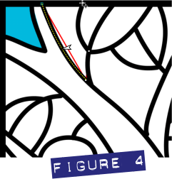
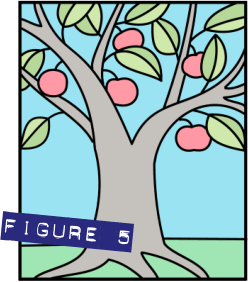
- Make sure all edges of your glass shapes are tucked underneath the lines. The red outlines help you to see any places where the edges might be sticking out, as shown in Figure 4)All areas of your de-sign must be filled with colour. When you are done you should have something like Figure 5.
- With the Selector tool, click-drag to marquee select all the coloured shapes. Clone them, a fancy phrase meaning to duplicate them in-place by pressing CTRL+K. Don’t deselect anything yet, or select anything else. Don’t even scratch an itch or breathe.
- With the cloned shapes still selected, on the Infobar at left where there are two drop-downs, change the Transparency shape (leftmost drop-down list) from Flat to Bitmap and (in the Transparency Type drop-down) from Mixed to Stained Glass. Didn’t you foresee that Stained Glass transparency was going be used somewhere in the process?
- Now your window will feature varying degrees of transparency based on the default bitmap, the striped greyscale pattern. Ack! Not what you want at all!
- To change this transparency map to something more artistic, click the down arrow next to the bitmap name box on the info bar and a drop down list will appear with small thumbnails of each bitmap stored in the Xara document. (see Figure 6).
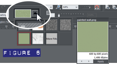
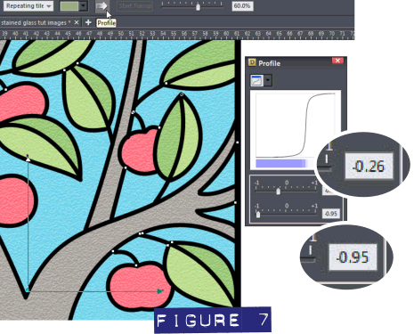
- Choose the painted wall bitmap and your window will show this texture, but both the preview and the effect will be very subtle. To enhance this texture, click the white profile arrow button and the profile box pops up. Set the top slider to -0.26 and the bottom slider to -0.95 (see Figure 7).
The texture is much more visible now, but it’s still lacking depth and shine, and all the shapes have an annoying similarity. To get the look of panels of glass that have been cut from different larger panes, you need to edit the respective transparencies of the shapes separately now.
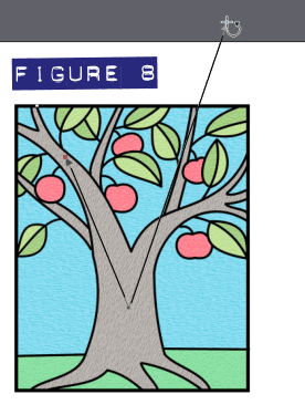 Start by selecting the transparency for the tree trunk and with the transparency tool select the outer transparency handles and then rotate the transparency.
-
Hold down the Shift key and reposition the handles to skew or squash the transparency. See figure 8.
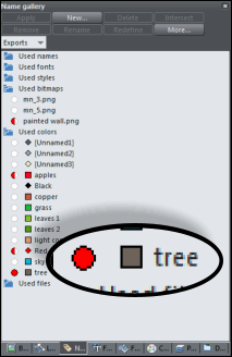 Here’s a trick to quickly apply the same settings to all objects of a same colour. Copy the tree trunk to the clipboard. Open the Names Gallery through either the utilities menu or the flyout gallery button on the right. Expand the used Colours folder and select the radio button next to the colour you want, in this case “tree”. All items on the page using that colour are selected. Now right-click and select Paste> Paste attributes, as shown in Figure 9. Repeat this with panes of other colours.
Polishing Your Work
Now for some depth and shine!
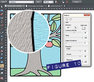
- Marquee select everything on the glass layer and group it all. Go to the live effects and with the group still selected click new. In the list of effects click stylization and select emboss. The embossing filter is fun to play with and I encourage you to experiment. The settings I used were: Light direction 143 Luminous intensity 50 Shine 300 Depth 86 smooth 85 reflection 255 (see figure 10). This will give the glass more depth and shine however you won’t see the full effect against the white page background. You’ll just have to trust me, when you put it on the background at the end it will look good.
Creating the Copper Caming
It’s time to turn your attention back to the caming.
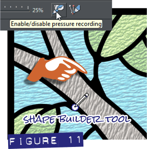
- Go back to the page and layer gallery and click Layer 1 to make sure it’s active and you are working there again. Unlock the caming shape; right-click, then choose Unlock all on page from the shortcut pop-up menu. This next step can be done two ways, depending on which version of Xara you’re using. If you have Designer Pro, the Shape Builder tool is the quickest way to do this, but if you are using Photo and Graphic Designer, or an older version of Xara, you can use the Shape tool to move control points (“nodes”) around, and add them if need be. Basically what you are going to do is to zoom in on one section of the caming at a time, and beef up the places where the lines join to create the appearance that someone soldered actual sections together, as stained glass caming is physically, traditionally done.
The Shape Builder tool Method: Choose the Shape Builder tool and a small nib from the selection on the Infobar. If you have a graphics tablet, you can use the pressure-sensitivity feature for even greater control. Select the caming shape and build up those joins. See Figure 11.
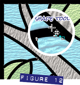
The Shape tool Method: Select the caming shape and use the Shape tool to move nodes outward, and pull the outside edges of the joins into a curve.( See Figure 12)
Don’t overdo this, or your “weld points” will look too thick and clunky. At this point I also made a correction to the design. Two leaves were almost touching in the upper right it left a very narrow area of glass. I added a small section of caming to join the leaves. When you are finished creating bulges along the caming shape(s), you’re all set to turn this flat line work into lovely copper-foiled caming.
- Select the caming and give it a copper colour; there’s a good medium dark one on the colour line.
- Clone it (CTRL+K) and give the clone shape the light copper colour on the colour line.
- Give the clone about 2pix of feathering on the Infobar, toward the right.
- Hold down the Alt key and use the arrow keys to nudge the clone left once and up once. The Alt key is a modifier that nudges a selected shape by one screen pixel regardless of what the default distance is in Options. The nudge gives the caming a little illusion of height but it still doesn’t look much like copper yet. But it will soon!
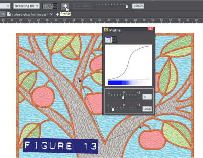
- With the clone still selected, choose the Transparency tool, and then on the Infobar choose Bitmap as the Transparency shape from the drop-down list at left. However, unlike the last time you did this, use the bitmap labeled mn_3.png from the Bitmap Name flyout list on the Infobar. Like the last time you added a bitmap transparency, hold down Shift to manipulate the handles and stretch or squash or skew the transparency. Have a bit of fun and experiment with this. Click the profile arrow on the Infobar to bring up the profile box and adjust the bottom slider over to the left to about -0.68. See Figure 13.
- With the clone still selected—with the Selector tool—hold the Alt+Shift and click to select the underneath copper coloured caming shape. Holding Alt while the Selector tool is the current tool lets you select beneath shapes and Shift adds to a current selection. You should now have 2 shapes selected on layer 1—look below the color line at left on the Status Line) to confirm this. Group both of these caming layers together, and then click the Live Effects icon on the Toolbar.
-
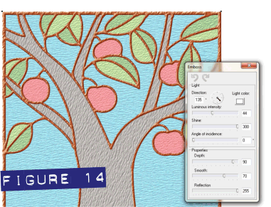 Click the New (filter application) button on the Infobar and then choose Stylization Filter>Emboss. I suggest the following settings to get the most visible effect: Direction 135 Luminous Intensity 44 Shine 300 Depth 90 Smooth 70 Reflection 255. See figure 14; we’re talking seriously gorgeous copper now! See Figure 14.
Making the Distressed Frame
Now you’ll graduate from stained glass artisan to woodcraft artisan and create a nice distressed frame for your window.
- Draw a rectangle the same height as the window and about 70 pixels wide, open the Bitmap Gallery (and with your rectangle still selected select the mn_3png. (this is the same one that you used for texturing the caming, all the bitmaps in this piece will be doing double-duty). Click the fill button at the top of the gallery to apply the bitmap as a fill.
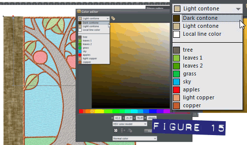
- Now you need to edit the colours in the bitmap fill. With the rectangle still selected, choose the Fill tool (the paint bucket icon) and then open the Colour Editor (CTRL+E). In the dropdown list you will see options to edit the Light and Dark contones. Make these a light and dark shade of brown. In Figure 15 you can see the colours I used: hex 433100 for the Dark contone and hex c7b8a1 for the Light Contone. If you like you can type these values directly into the hex value filed of the Colour Editor to use these exact colours.
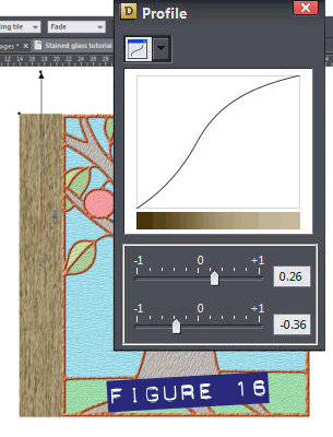 Select the outer control handle of the horizontal fill and while holding the Shift key, drag it inward and upward to squash and skew the fill. Holding the Shift key while manipulating a bitmap fill breaks the 90 degree opposition of the control handles and the result can be an interesting, disproportionately scaled and skewed bitmap fill. Play around with this until you get something resembling a wood grain. Use the profile sliders on the Infobar to enhance the contrast of the grain. See Figure 16.
- Right click and drag to create a copy of the first board and place it on the other side of the window. Make another copy and place the cursor just under the outer corner of the bounding box and the rotation handles should appear. Press the CTRL key (this constrains the degrees of rotation) and rotate the shape until the board is level and horizontal. Place this board at the top of the window and stretch it to fit across the top of the window and the two vertical boards. Make a fourth board and place it at the bottom. Slightly adjust the fills of the 3 new boards to make each one slightly different.
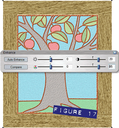
- Select all the boards and group them. With this group still selected. Click the Live Effects button on the Toolbar, click the New button, and select the Enhance effect at the top of the list. Set the contrast (top right slider) to 20 and the blur/sharpen (bottom right slider) to 85. See figure 17. Click the x to dismiss the Enhance box.
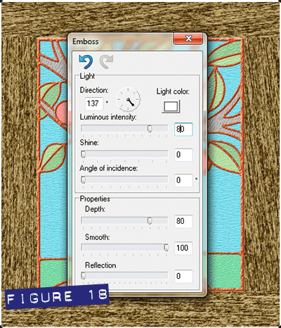
- With Live Effects still the active tool, click New>Stylization Filter>Emboss. This time set both the shine and reflection to 0 and the direction to about 137, luminous intensity to 80 depth to 80 and smooth to 100. Figure 18 shows your progress.
Now you have a nice rough wood frame, but you aren’t stopping here!
 Clone the frame (press Ctrl+K), choose the Live Effects tool, but this time you want to remove all effects from the frame. Do this by clicking the icon with the 3 red X symbols. See Figure 19.
- With the clone still selected, go to the Bitmap Gallery and select the painted-wall bitmap, then click the Fill button at the top of the gallery. You have just given the frame a nice fresh coat of paint!
- Now originally I promised a distressed frame: choose the Transparency tool and with the painted clone group selected, choose Bitmap transparency from the Transparency Shape drop-down list on the Infobar, and from the Bitmap Name fly-out list, choose mn_5.png Now your paint has all but disappeared, but don’t panic: you’ll restore most of it.
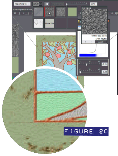 Click the arrow icon on the Infobar to open the Profile box, and then pull the bottom slider over toward the left almost all the way, but not quite: -0.94 is good. The top slider controls how much paint is left on the wood or how much has been chipped off. I used a setting of about -0.28, and the result is fairly handsome as you can see in Figure 20.
- Marquee-select both the frame and window and group them. Congrats! The heavy-lifting is done, and the window is ready to be set on to a background.
Making the Final Composition
Pull the background on to the page; it should slide in behind the window because of the order of layers in this document.
You’ll notice that the addition of the background brings the glass to life; this is because of the transparency you added earlier in this tutorial. Now the window has multiple live effects and all of these effects are being rendered each time you move or re-size the window, so at this point it’s a good time to make a bitmap copy and set the vector version aside.
- Let’s try 300 dpi as the resolution of your bitmap copy, because this is the resolution of high-quality printed magazines and coffee table books. With the window selected, press Ctrl+Shift+C to open the Create Bitmap Options box. Click the Bitmap Size tab and then choose 300 from the DPI (Resolution) drop-down list.
- Click the Palette Options tab and then choose TrueColor+Alpha from the Color Depth drop-down list. Click Create and the copy is inserted into the document. You can move the original off to the sides now and use this copy.
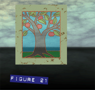 Re-size this bitmap copy of the window and set it on the background, so it is a little off-centre, and there is enough room for the reflection, as seen in Figure 21. Give the window a bit of feathering to soften the crisp edges and make it appear more like it’s part of the scene; the Change size of feather region feature is (by default) toward the right on the Infobar. About 1 pixel Feathering should do it.
- Make a copy (Ctrl+K), click the Flip Vertically button on the Infobar, and remove the feathering from this copy.
- Zoom in and with the Selector tool, align this upside down copy with the original.
- With this copy selected, choose the Live Effects tool, and under Soften filters, choose Gaussian blur, set it at about 12. Click the close button on the Gaussian blur panel to apply the effect and close the panel.
- With the Transparency tool, apply a Linear transparency to finish off the effect; opaque at top, transparent at bottom. I like to use a multi-stage linear fill for this, as follows:
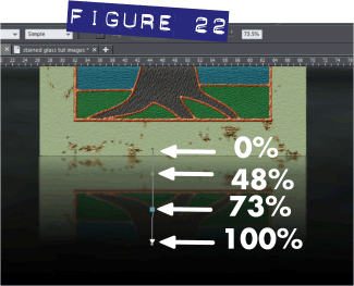 Double-click anywhere along the Transparency line to add a transition control point, a point along the transparency at which it has a unique value. Add two extra nodes and drag them to space them out along the line. The top (start transparency) should be set at zero, the second at about 48%, the third at about 73%, and the end at 100%. See Figure 22.
Select the window, the reflection and the background. You can do this if there are no scraps in the document by pressing Ctrl+A. Press Q on your keyboard to clip all the elements together and you are done! Sit back admire your work for a minute—okay, two minutes if you really like your work— then post it up on the tutorial thread and show us how you did!
Discuss this tutorial and show the work it inspired in the Xara Xone forum on TalkGraphics.com

(Angelize online), is the co-publisher of the weekly, Good Morning Sunshine! that has brought a smile to the faces of print and online subscribers for 14 years. She uses Xara products extensively in her work for her firm, SunWings Graphic Design. She loves to teach and share her love of Art though her YouTube channel, her contributions to The Xara Xone and her work on Xara’s TalkGraphics forum as a moderator. You can drop her a line through her website or better yet stop by the Xara Xone forum on Talkgraphics and chat with Angelize there.
The tutorial Designing a Stained Glass Window including the artwork and the downloadable examples file are Copyright © 2013 Frances Proctor. All Rights Reserved.