|
|
|
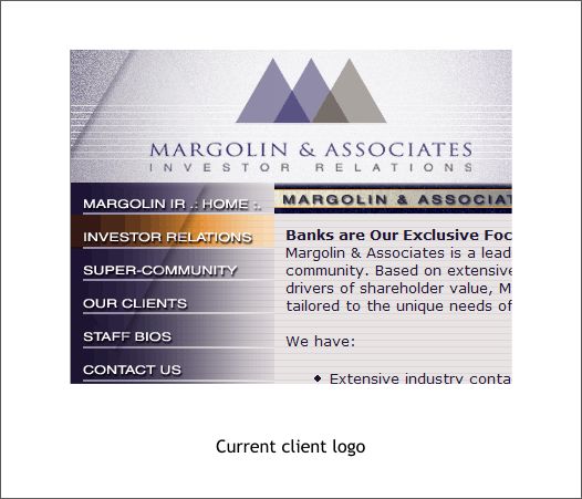
Magolin and Associates is an investor relations consulting company based in the United States midwest. They asked me to update their current logo (shown below). The client felt the current logo lacked pizzazz. I tried to argue that the logo was just fine and not to worry but they would not accept no for an answer.
The current logo as seen on the client's Website.
I started out working with the palette of colors the client was currently using because they had a good corporate look and feel of stability and professionalism. This design was very close to the current logo but uses interlocking triangles to represent the go-between nature in which Margolin works with financial institutions and consumers.
This design breaks away from the triangles but maintains the bridging metaphor of consumers and financial institutions. In each of these logos, I experimented with different elegant serif fonts and especially those with interesting ampersands (&).
This design uses 3 1/4 circles. Each quarter is from a circle with a circular fill. The first two 1/4 circles make a stylized M while the last makes a stylized A.
I liked this design a lot. It was close to the current logo and yet the lines going through the triangles added a contemporary feeling as well as suggesting connectivity between the company, the financial institutions and the consumer.
The design shown above was based on a design done by a previous design firm, which was not working, but which the client felt had promise. I simplified the design and made a simple set of 3 arches. Again the metaphor of a bridge between the consumer and the financial institution.
The client loved the 3 arches but asked for a different color scheme to match a logo they were using for another service they offered.
The client was not happy with the way the Inc. disrupted the symmetry of Margolin & Associates and asked for alternate ways of representing Incorporation. Nothing I did worked as well as having Inc. on one line but this seemed like a good compromise.
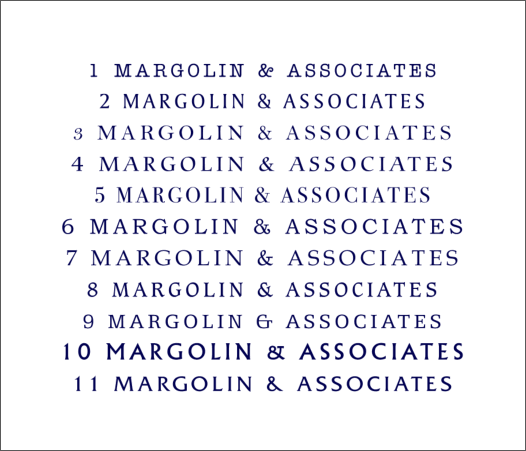
We had finally arrived at a design and color scheme with which my client was happy. But my client advised me that no one in her company liked my choice of fonts. They felt they were all stuffy and old fashioned. I tried to argue that they were elegant and refined and created an upscale impression but they would have none of that.
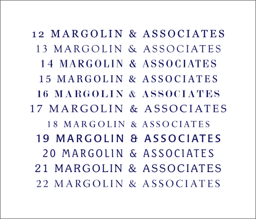
So I presented the 22 examples of less stodgy fonts shown in the two type explorations shown above. I e-mailed these selections to my client. And waited. And waited. And waited, and...
The above is a graphic representation of what finally happened. I did get paid for my time. And I was happy with my designs. Last time I visited the Margolin & Associates, Inc. Website, they were still using the old logo. You win some and some you don't win.
|
||
|
|
