|
|
|
One of Xara's strengths, it's fantastic Anti-aliasing engine, which creates such incredibly smooth screen images and output, can be a bit of a problem when you are working with very small text. Text that you see on the computer screen relies on Anti-aliasing to smooth the rough edges and give it the appearance of being sharp and crisp. It is kind of an oxymoron in that you blur the edges to make the type look sharp. But that is how it works. This is well and good for larger text, but for very small text, Anti-aliasing can make the text fuzzy and not sharp.
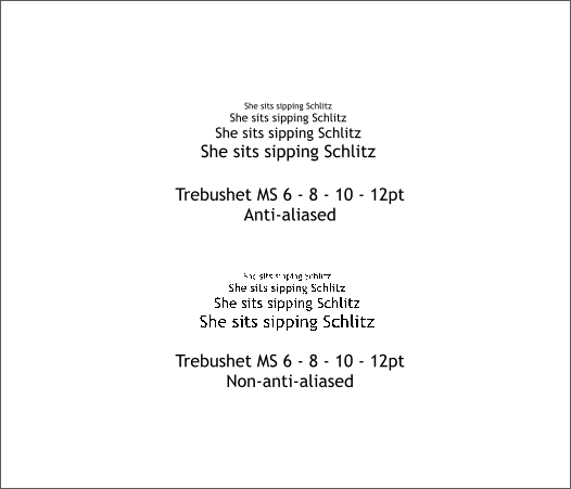
The illustration above shows 2 identical sets of text in sizes from 6-12 points. The top example is with Anti-aliasing enabled, the second is with Anti-aliasing disabled. Even though it is slightly fuzzy, the top text is easier to read. Even the small 6pt text.
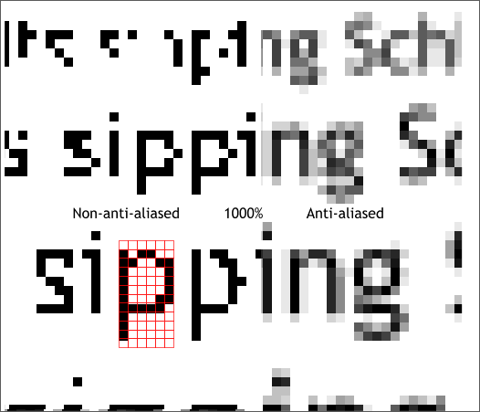
All text is made from a grid of pixels. The smaller the grid, the fewer pixels are available to build the letter. The result is less detail in the text. The example above has been enlarged 1000% to illustrate what I am taking about. The text on the left is not Anti-aliased and you can see the individual pixels quite clearly. The text on the right is heavily Anti-aliased and should give you an idea of how this process works with text. Anti-aliasing is a processing of blending the pixels on the edges of objects with pixels from the background to eliminate what we used to call the "stair step" or "jaggies" effect. If you push back from your monitor a fair distance the text on the right should actually look better. Small text having fewer pixels to build each character with, produces very skeletal shapes and depends on Anti-aliasing to give them their form.
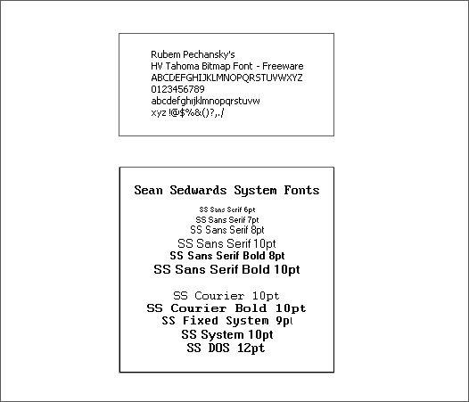
The solution for very small text is bitmap fonts. Bitmap fonts have no Anti-aliasing and only look good at the size for they were created. The two examples shown above are free bitmap fonts available from the Shareware Page. Rubem Perchanchsky's HV Tahoma is for use at 8pt only but reads very well at that size. Sean Sedwards System Fonts come in a variety of small sizes and were designed to mimic Window's system fonts. You can find additional bitmap fonts at DaFont.com/Bitmaps.
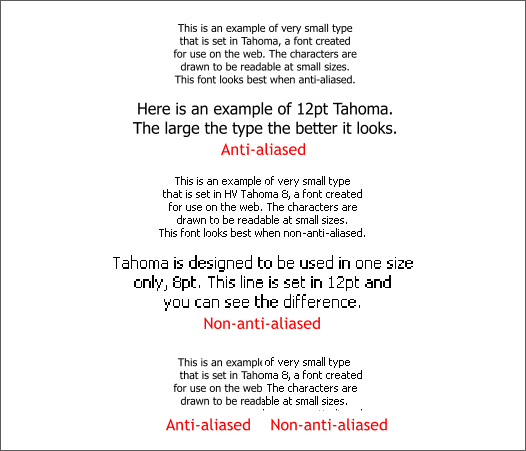
There are several fonts that come installed in most Microsoft applications that have been designed to work well on the web at a variety of sizes. These include Verdana, Trebuchet, Tahoma and Georgia. But they are True Type fonts and require Anti-aliasing to look right. In the example above, I have used Microsoft Tahoma, a True Type font, and Rubem's HV Tahoma bitmap font. The top example shows Tahoma True Type Tahoma in 8pt and 12pt. The middle example is HV Tahoma bitmap which looks fine at 8pt but not so fine at 12pt. Both of these examples are shown in Normal (non-Anti-aliased) screen display (Window > Quality > Normal). The bottom example is a side by side showing of 8pt Microsoft Tahoma Anti-aliased and HV Tahoma non-Anti-aliased. The non-Anti-aliased bitmap text is a bit sharper and easier to read.
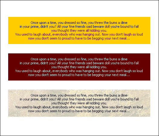
The 3 examples shown above all use 8pt HV Tahoma over colored and a pale photographic backgrounds and all look surprisingly good. TIP: If you need to create a text block of very small type for viewing on the web, create your text using a bitmap font at the point size for which it was designed. Turn the View Quality to Normal (Window > Quality > Normal or use the View Quality slider at the top of the Infobar and just to the right of the Width drop down list. GIF or 8-bit PNG export with no dithering works best. JPEG tends to get a bit soft and defeats the purpose.
|
||
|
|
