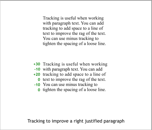


Art directors and graphic designers who work with columns of left
justified text are concerned about having a “good rag”. This refers to
the flow of the text on the right side of the text block. Tracking line per
line can help to create a pleasant wavy look to the right side of the text
as shown in the bottom example. Small amounts of tracking have been
used here to extend and contract each line.
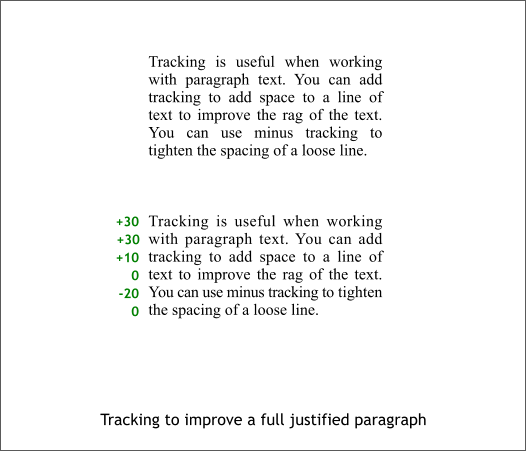
Tracking can also be used when working with fully justified paragraphs
of text to minimize the awkward space between some words. A small
amount of minus tracking can also bring a word up to the previous line.
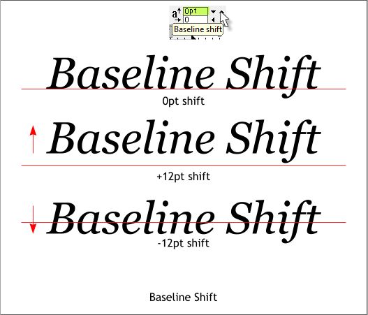
All text sits on an imaginary baseline. Baseline Shift moves the selected
text up or down. Sometimes if you have a headline with several lines of
text, the lines may not appear to be equally spaced. Especially if one
line has ascenders and/or descenders and another line does not. You can
use Baseline Shift to visually compensate for this.
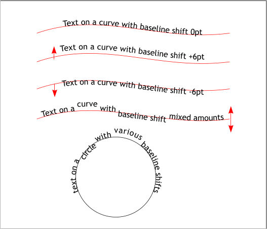
Baseline Shift can additionally be used with text on a path or curve.
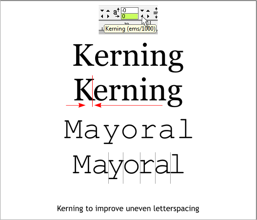
Kerning adjusts the amount space between two characters. Most
computer fonts today have built in “hinting” which automatically
determines how much space to place between each character so all the
characters in a word appear to be evenly spaced. To my old art
director’s eye, there is a little too much space between the K and the e
in the first example above. I have used a small amount of negative
kerning to close the distance. This is done by inserting the text cursor
between two characters then clicking the left or right arrow buttons.
The second example is known as a fixed space font. The space between
each character is uniform and not intended to be aesthetically pleasing.
I have kerned each letter pair as indicated with the thin gray lines to
create a more visually attractively spaced word.
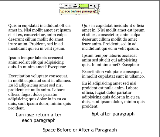
Space Before or After a Paragraph When working with a paragraph of
text, most users just add an extra carriage return after each paragraph.
The old extinct typographers under the direction of the equally old and
extinct art directors and graphic designers of my generation preferred
less space. This can be accomplished by specifying a certain amount of
space before or after a paragraph. This spaces out the paragraphs in a
more reader friendly way.