

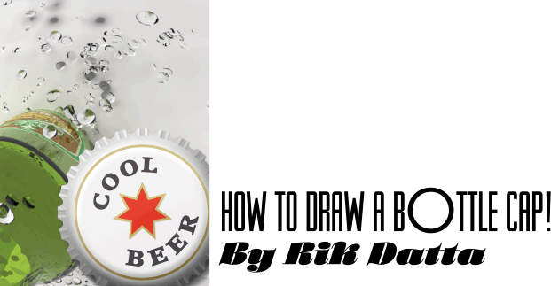
A Tips and Tricks Tutorial By Rik Datta (“Rik” on tg)
Flip Your Lid: How to Draw a Photorealistic Bottle Cap
It’s Summer in the Northern Hemisphere, at that means plenty of outings and refreshing beverages. This month to pay tribute to the season that is one big holiday, you’re going to learn how to draw a photorealistic bottle cap in Xara. Although this example shows a fictitious “Cool Beer” logo, you’re encouraged to design your own logo and check out Gary Bouton’s video tutorial on logo creation. If you’re not of drinking age, consider designing a soft drink logo—alright, without further ado…
Creating the Crimping on the Bottle Cap
-
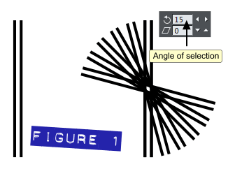
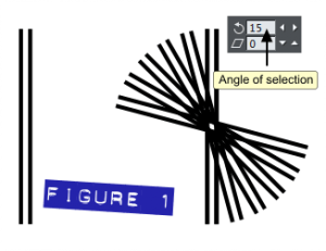 Draw a rectangle that’s 5px wide and 240px high. Now, in ‘Options’ my nudge is set at 3.8px, so you will want to set it to this value, too: press Ctrl+Shift+O to access the Options box. Press Ctrl+K to clone the rectangle, and then use the keyboard’s right-arrow key to nudge the clone to the right by 3 steps (three key presses). The second rectangle is already selected, so press Shift+click on the first rectangle to additively select it, and now both rectangles are selected. Press Ctrl+G to group both rectangles. With the group selected, press Ctrl+K to clone them. Type 15 in the ‘Angle of Selection’ box on the Selector Tool Infobar (the Selector tool should be your current chosen tool), and then press the ‘Enter’ key. See figure 1.
-
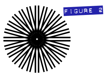
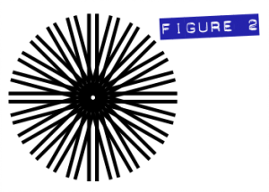 You can keep cloning and rotating this until you have a 360 degrees-worth of shapes. or if you’ve done this 5 times, then you can select all 5, then Ctrl+K and rotate 90 degrees, by entering 90 in the ‘Angle of selection’ box on the Selector tool Infobar. Select all (Press Ctrl+A). and then press Ctrl+G to group all shapes. See figure 2.
-
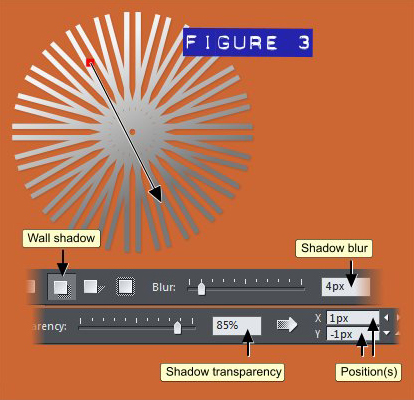
Select the Fill Tool and then drag down and to the right; you’ll see the result in figure 3. After angling the fill as shown, set the two end colours of the fill with #f3f3f3 at the top and #787878 at the bottom. Choose the Shadow tool from the Toolbar and then set the Blur amount to about 4 pixels and the Transparency Amount to 85%. This is a very minor shadow—use the Position controls on the Infobar to offset the shadow from the shapes origin by only 1px, as shown in figure 3.
-
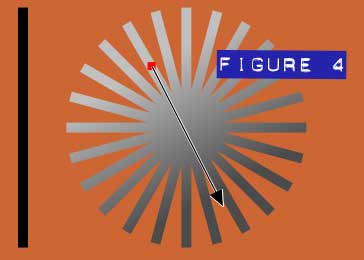 Draw a rectangle 10px wide and 240 high. Follow steps 1-3 exactly as before with this slightly wider shape, until you have a complete set of asterisk-patterned shapes. Group all shapes and apply a Linear fill as before with #c0c0c0 at the top and #4b4b4b at the bottom. See figure 4.
-
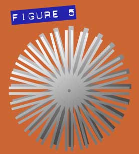 Position the new shape over the previous one, and then press Ctrl+B to send the new shape to the back of the layer. Marquee-select both shapes. See figure 5.
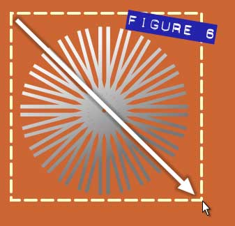 Tip: With the ‘Selector Tool’ selected, click-drag your mouse in the direction shown here to draw a box around the objects you want to marquee select. It’s usually a motion diagonal to the sides of the page. See figure 6.
-
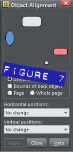
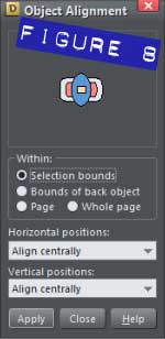
Press CTRL+SHIFT+L to open Object Alignment, as shown in Figure 6. Select ‘Align centrally’ for both the Horizontal and Vertical positions (See figure 7.) Click ‘Apply’. See figure 8.
-
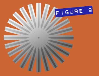 You should now have two shapes as shown in See figure 9.
-
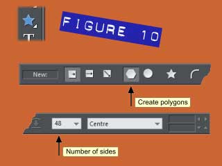
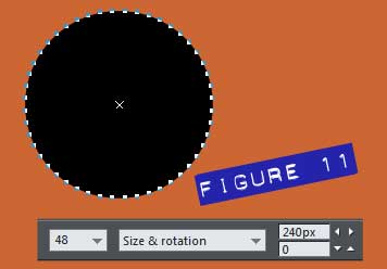
Select the Quick Shape Tool and make sure on the Infobar that only the Create polygons is selected and set the ‘Number of sides’ to 48, as shown in figure 10.
Hold the Ctrl key and click-drag your mouse downwards to create a shape. This shape will look like a bit like a circle with selection handles (dots) all around it. Set the size of the shape to 240px. See figure 11.
Dimensionalizing the cap
You’re more than halfway through the hard part of this bottle cap creation! Here’s the next steps:
-
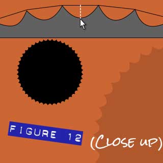 Click-drag between two points, as shown below, so as to create semi-circles, to change the shape as shown in See figure 12.
-
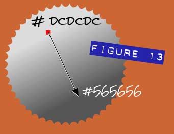 Apply a ‘Linear’ fill as before with #dcdcdc at the top and #565656 at the bottom. See figure 13.
-
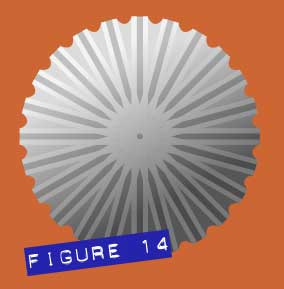 Set this new shape behind the others, marquee select all shapes and align centrally, using the Alignment feature (Ctrl+Shift+A). See figure 14.
-
Draw a circle 220px, apply 3px of feathering and apply a Linear fill as shown in figure 15, with #e2e2e2 at the top and #636363 at the bottom. Position the circle on top of the other shapes. Marquee select all shapes and align centrally.
-
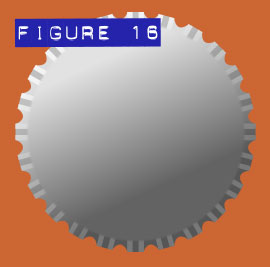 Position the circle on top of the other shapes. Marquee select all shapes and align centrally, as you can see in See figure 16.
 -
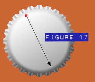 Press Ctrl+K to duplicate (in place) the circle in the previous step and then while selecting the colour handles one at a time, in the Color Editor, change the Linear fill’s colours to #fefefe at the top and #a9a9a9 at the bottom. Then apply 13px feathering. See figure 17.
-
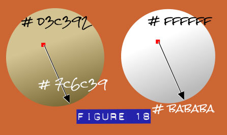
Draw a circle of 193px in diameter, and then apply a Linear fill, dragging in the direction shown in Figure 18. Then, clicking one color handle at a time (and using the Colour Editor) apply the Hex color #d3c392 at the top and then #7c6c39 to the bottom handle.
-
Draw a circle of 185px in diameter. Apply a Linear fill, dragging in the direction shown in Figure 18 with the Fill tool. Then, clicking one color handle at a time (and using the Colour Editor) apply the Hex color #ffffff at the top and then #bababa to the bottom handle. What you have now is a shaded top to the cap, with a slender gold band, part of the logo you’ll create later in this lesson. See figure 18.
-
Place both circles on top of the shapes you’ve created up ‘til now, and then align them centrally.
-
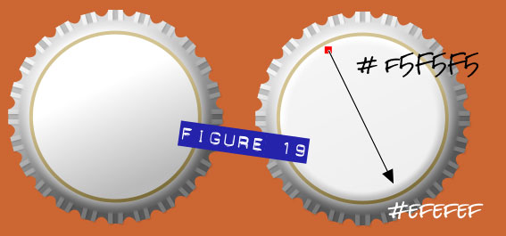
Clone the top circle (select it and then press Ctrl+K), and then apply 10px of feathering, using the field on the Infobar. Apply a Linear gradient fill as shown in Figure 19; apply the Hex color #f5rf5f5 to the top color handle, and then click the bottom color handle and specify the Hex color #efefef, using the Color Editor. What you’ve accomplished is a subtle effect that increases your composition’s photorealistic quality: the very top of the cap is fairly flat colored, but the underlying edges and crimping now have a brightness fall-off. See figure 19.
-
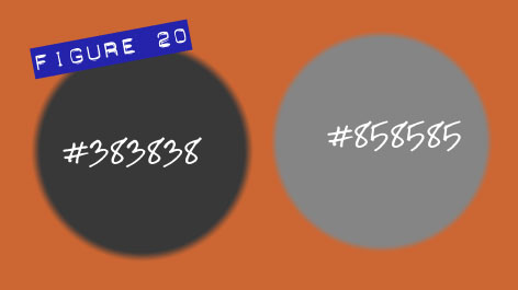
Now, you’ll create a photorealistic drop-shadow. Unlike simply adding a soft-edge shape behind the cap, you’ll use two differently colored shapes, suggesting what are called the umbra (a completely dense area where light is obstructed from view) and a penumbra (a lighter, broader, more diffused shadow, light is only partially obstructed). Now forget the technical jargon—the shadow just looks cool! Draw 240px diameter circle. Fill it with solid #383838 colour and then apply 11px feathering. See figure 20. Then draw a second 240px circle, and then use colour #858585 with 9px feathering. Now press Ctrl+Shift+B to put the lighter shape behind the darker one. Don’t deselect it yet.
-
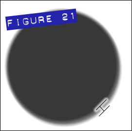 Your default keyboard nudge value is probably only a few pixels so try this; press the down and the right arrow keyboard keys twice, perhaps thrice, until the lighter, larger shadow shape “underlaps” the larger one, as shown in See figure 21.
-
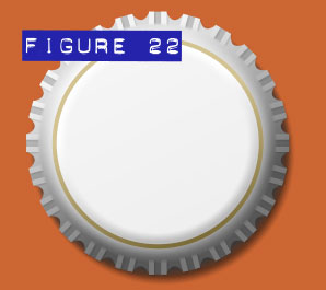 Group both shapes (Ctrl+G), press Ctrl+B to put the grouped shadow to the back of this layer, and then position the group behind the bottle cap. As you can see in Figure 22, the cap not only looks great, but it also has an orientation in 3D space on your 2D page, due to just a little investment of time in shadow creation. See figure 22.
Name That Beer!
You could call it quits now, but why not put a name, a sort of simple logo, on the beer bottle cap now? Would you serve generic beer to your guests at a party? Okay: would you at a party for your boss!? This is the fun and final part of the bottle cap design.
-
Before continuing, you should group the bottle caps shapes, and then the only other item on the page is the shadow group. You’ll be doing some rotation (sorry—you’ll be rotating some shapes!), and because the shadow group is off-centre with respect to the cap, you don’t want the shadow grouped with the cap shapes.
-
If you don’t see Xara’s Ruler displayed around the left and top of the page, then press CTRL+L. With the Selector tool, select the centre circle of the Bottle Top group of shapes, to show the control handles.
-
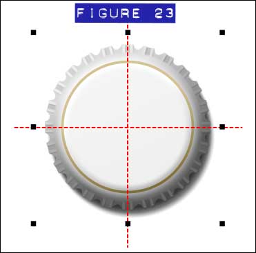 Click+drag horizontal and vertical guidelines out of the rulers, one axis at a time, to the centre of the control handles, as shown in figure 23. The guides are shown here as short dashed red lines, but on your page, they’ll extend the full length and breadth of your document. See figure 23.
-
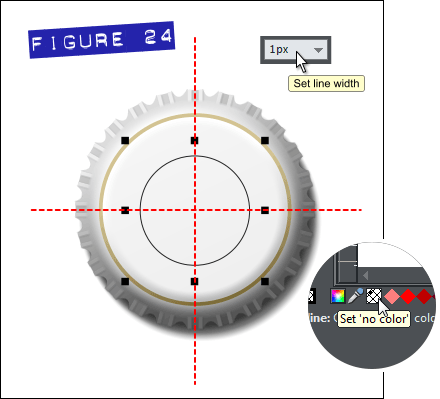
Draw a circle of 110px in diameter. On the Infobar, select the Line size of 1px. And set ‘No colour’ for the circle by left-clicking the empty box at the left of the colour line at the bottom of the interface, as shown in figure 24. Position the circle on the intersection of the guides. See figure 24.
-
I’ll use the fictitious “Cool Beer” in the following steps, along with a typeface you might have installed from as previous version of Xara: Cairo SF. This might not seem like the most imaginative of font choices, but you’ll see shortly that the font takes on a more interesting look when it follows the path of the circle you drew in Step 4. Cairo SF is a snub-serif, Roman typeface, similar to Rockwell, Clarendon, and New Century Schoolbook Bold, any of which you should feel free to substitute. You can set Cairo SF to 19pt height on the Infobar when the Text tool is chosen.
-
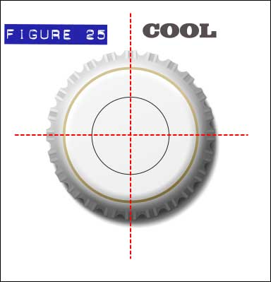
Colour the text #382e30 and with the Transparency tool chosen, give the text 15% transparency, so it looks as though the text is on the cap and not above it. See figure 25.
-
Zoom into the unfilled circle, because this is the harder of the two shapes you’ll work on now. With the Selection tool, select the circle, hold Shift and then select the text; now both are selected, because holding Shift performs additive selection.
-
From the Arrange menu, choose ‘Fit Text to Curve’.
-
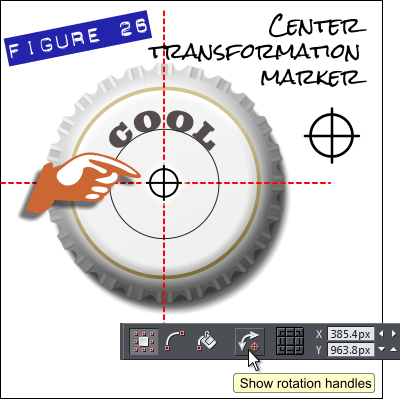
If the text is not central along the top (centered along the horizontal axis), then click the ‘Show rotation handles’ button on the Infobar (see figure 26), and then drag the center transformation handle to the intersection of the guidelines. Now drag on a corner rotation handle to adjust the text’s degree of rotation and position.
-
With the parent circle and child text shapes selected, you’ll see “Many” as the Line width description on the Infobar. At any time, you can set this to None from the drop-down list so the controlling circle is hidden.
-
Draw another 147px circle; hold Ctrl+Shift and then drag the Ellipse tool precisely over the intersection of the guides to make the circle perfectly circular, beginning at the centerpoint outward. Apply the 1px line width, set ‘No colour’ so the circle has no fill.
-
Type the word ‘Beer’ in font Cairo SF at 19pt height. With the Text Tool selected, apply ‘Tracking’ value of 330 on the Infobar. Colour the text #353139 and apply 11% transparency.
-
Select the circle and Shift+Click the text to group select the two items. Then from the Arrange menu, select ‘Fit Text to Curve’. Right click on the new text and select ‘Reverse Text on Curve’.
-
If the text has left-to right alignment problems covered earlier with the word “Cool” (see steps 8 and 9) , click the ‘Show rotation handles’ button on the Infobar, move the center transformation marker to the intersection of the two guides, and then use one of the corner rotation handles to correct the rotation and position of the word “Beer”.
-
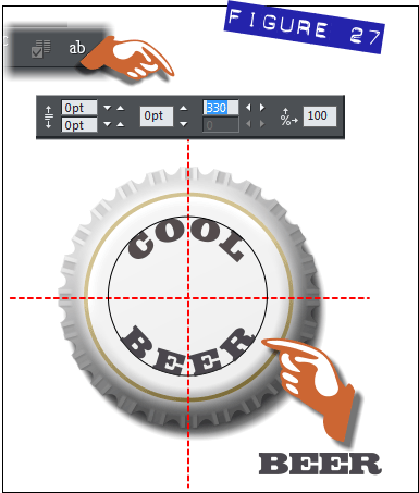
Set the ‘Line width’ to ‘None’. figure 27 shows the progress up to this point, as well as the new Page & Layout Designer features within Xara Designer Pro. To reveal the tracking controls, the Text tool must have the text highlighted, you click the Text Tool flyout on the Infobar, and then enter the amount of spacing between characters in the Tracking fields.
Bracketing a symbol with the Text Along a Curve
The finish line is in sight for this intermediate tutorial: it would be a nice design touch to put a symbol—a star—centered between the words “COOL” and “BEER” on the bottle cap. You can charge more money for the brew then. Here’s how to conclude this month’s tutorial so you can get back to other things, such as reaching for a tall cold one!
-
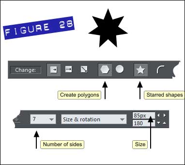
Select the Quick Shape Tool and ensure that ‘Create polygons’ and ‘Starred shapes’ are clicked on the Infobar. Choose ‘7’ from ‘Number of Sides’ drop-down list. See figure 28.
-
Hold the CTRL key and click-drag your mouse upwards to create a symmetrical, starred shape.
Enter 85px in the ‘Size’ box and then press Enter on your keyboard to make the change.
-
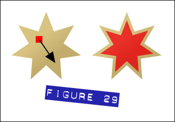 Apply a ‘Linear’ fill as shown in figure 29, with the Hex color #d8c381 at the starting color handle, and #c2ac6c at the bottom.
-
With the star shape selected with the Selector tool, press CTRL+K to clone this shape.
-
Select the ‘Fill tool’ and change the fill points to #eb1e1e at the top and #e21313 at the bottom.
-
Choose the ‘Quick shape tool’ and change the size of this recolored duplicate to 65px.
-
With the Transparency tool, Apply 11% Flat transparency.
-
Marquee-select both star shapes and then place them centrally on the Bottle Top. The intersection of the guides will come in useful for this task, and you can even use the arrow nudge keys on your keyboard for precise placement.
Finished! Go get a Church Key now!
The Bottle Top is now complete. All that’s left is to place it on a simple background such as a gentle linear gradient. If you want to place the Bottle Top on different backgrounds, then the two feathered circles that make up the shadow would benefit from different shades of new compatible colors and probably adding a Transparency mode for these shapes to Stained Glass at a reduced opacity.
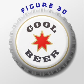
Because this design is entirely vector in nature, it can be scaled as large or as small as you need for a poster, a coaster for mugs at your favourite pub, and even for a “clingie” vinyl graphic to affix to the side of a delivery truck. You can also change the bottle cap colour to something else and perhaps make it Butter Beer if you’re a J.R. Rowling devotee! The finished illustration (see figure 30) can be downloaded so you can see how each step works with one another.
Enjoy!
Be sure to thank Rik for this great tutorial by showing us your caps and lids in the Talkgraphics.com thread, July 2013 Tips and Tricks: How to Draw a Photorealistic Bottle Cap.

(Rik online), TalkGraphics Moderator and member since 2009, says that he has learned the most from other members. Although Rik doesn’t use Xara Designer directly in his job—but rather for personal pleasure, he has used the world’s fastest drawing program to help visualize concepts, flowcharts, and other training collateral material for his 9 to 5 tasks.
Instinctively curious about how the work of others is produced, Rik has quickly become a valued resource on TG for logo design and a slick, sometimes reflective material rendering that has become instantly recognizable by fellow members.
The tutorial How to Draw a Photorealistic Bottle Cap including the artwork and the downloadable examples file are Copyright © 2013 Rik Datta. All Rights Reserved.