

A Tips and Tricks Tutorial By Gary Bouton(“gare” on online)
Going Beyond 3D
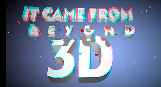
Sorry; I went for the most provocative headline I could think of at 2am after our coffee maker broke, so let me explain first what I’m going to present this month. A lot of us like to use the Extrude tool to create powerful messages like this one in Figure 1:
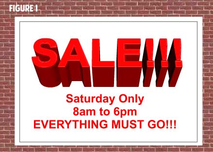
Now, there are several things wrong with this sign, and I’ve addressed some on them in the April 2012 Xara TV tutorial, but let’s concentrate on how uninspired and creatively lazy this extruded “sale!!!” text is. Use of all caps is okay occasionally, but three exclamation points doesn’t emphasize a thought—excessive use of exclaims makes the vendor look desperate or just finished elementary school. People who examine ad effectiveness on the Web can tell you that one exclamation mark stresses a statement perfectly adequately.
Now, about the extruded text; the sides and the front face are the same color. This is boring. The lighting on the text (Xara offers three lighting sources) was left at its default. Additional boring. And it looks as though the sign-maker click-dragged on the face of the text and pushed upwards a little to extend the extrude and angle the text upwards. I’m sorry, but this takes as much effort as opening a can of soda.
Making Visually Compelling 3D Scenes
What I want to show you how to do this month is to give both extruded shapes and hand-drawn 2D shapes something extra; to not just extrude them, but to position them in a creative direction is space, to suggest a diorama, a more explanatory and exciting arrangement of a visual message.
First, open the zip archive and extract Elvis.xar. Our rock and roll idol’s silhouette will serve as the foreground element, and you’re going to build a semi-circle of text behind the singer, not a line of text that extrudes away from you with the front faces angled all the same.
Get the Right Typeface for The Elvis Scene
Your shopping list isn’t complete. You need a typeface that reflects a little 1950s retro look, a condensed font but bold. I’m going to use Bodoni Poster Condensed in the following screen figures; if you don’t own this typeface, here’s some alternatives. 1001 fonts offers a knock-off of Onxy, called Sardonyx, click the green Download button, unpack it, install it and the creator states that this is free for personal use, so don’t make a career using this font unless you buy it.
Also, Corvinus Skyline by Linotype is an excellent narrow, retro font. If your budget is small, do a web search. You’ll probably find other vendors with a similiar font for a smaller price.
The Extrude Tool’s Orientation Features in 3D Space
If you extrude a character by first clicking the Extrude tool and then clicking the Apply Extrusion at the upper left of the Infobar, you’re not going to get an exciting result, because the default edge of the character is Rounded at a value of 30, and the Angles you choose from the Extrude Parameter drop-down list are all set to zero (0). However, you’re going to use this list of Angles instead of interactively rotating the characters you’ll create, because you will run into a wealth of problems if you try to make a text arc in 3D by manually pushing and pulling the extruded fonts around.
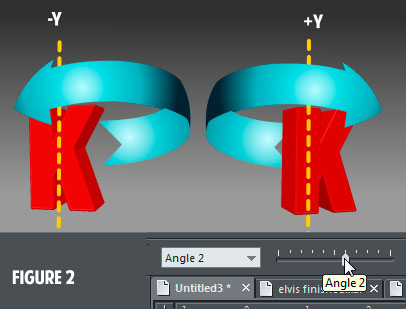
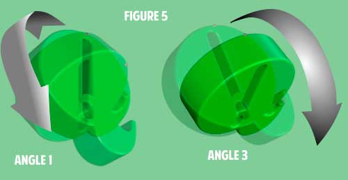
This is good stuff to know in the future, so forgive me for getting a little side-tracked with this month’s tutorial. With a character simply extruded, facing perfectly forward, if you choose Angle 2 from the Extrude Parameter drop-down list, and then drag the slider left, you’ll wind up with an extruded character that rotates to the left. The Extrude tool doesn’t truly support the common rotation modeling convention of X (rotation similar to a somersault), Y (rotation as though you’re spinning around), and Z (as though you’re holding a paper in front of you, facing you and rotating it). It obeys the Y rotational axis (Angle 2) the axis running top to bottom as shown in Figure 2, and the X rotational axis by using Angle 1 or the Angle 3 controls—but only if the shape has not been previously rotated along its Y axis (Angle 2, see Figure 3).
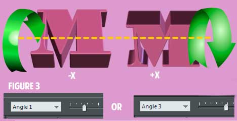
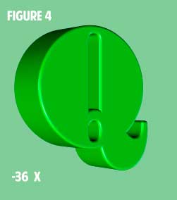
Now, there is a difference between Angle 1 and Angle 3’s X rotation when the object has already been rotated around the Y axis. Figure 4shows the extruded character Q, rotated along the X axis by a value of -36. See the difference (try this out yourself) when in Figure 5, Angle 1’s slider is dragged back and forth. The rotation suggests a left leaning arc, while if you try the same thing with Angle 3 chosen, the character arcs in a right-leaning direction.
The point here? There’s two of them: First, if you get a specific rotation of a character totally messed up, set Angles 1, 2, and 3 on the Extrude Parameter dropdown list to zero (0), because you’re never going to straighten this thing out manually by dragging on the face of the character in the document window. Point 2 is that if you rotate a character using the Angle 1 option (and you use the Infobar, you don’t directly drag on the extruded shape), you then have precise control over how individual characters—not a typed phrase because it’s all one shape—can have the same x rotational value and in the example to follow, the characters all “look down” at the same angle. This is not a revelation nor world-class art; here’s the deal—after rotating all the characters the same amount downward, you select one character after another, and assign it a unique Angle 2 value (the left to right value). So left to right in the composition, you have character 1 rotated by Angle 2 at say 35, character 2 angled at 17, character 3 at zero, and continue increasing positive values until you’ve approximated an arcing background of 3D text so you can place the provided silhouette in front of the text.
C’mon, Bouton! Where’s the Tutorial?
I think that’s enough background info! Let’s jump into the first tutorial.
-
Install and get ready to use your condensed, Roman, Bold, Retro(ish) typeface. You’ll see that I’m using Bodoni Condensed, which I think came in a Microsoft TrueType pack about a billion years ago.
-
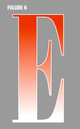
Type a Capital “E”. Make it about 375 pixels in height, and then with the Fill tool, put a gradient inside the character, going from white at the bottom to a medium brick red at top. See Figure 6, and put a white 2 pixel outline around the character. This outline will be translated to the side of the extruded shape after it’s been dimensionalized.
-
Now you want the remaining 4 characters to be single-standing characters…not part of the entire word you’ll create. So with the Selector tool, right-drag the “E” to the right, then release the mouse button to drop a copy of the “E”. With the Type tool, highlight the duplicate “E” and then type capital “L”.
-
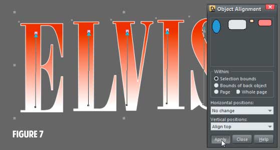
Repeat step 3 until you have as separate characters E, L, V, I, and S. Arrange them with the Selector tool so they appear to be moderately evenly spaced. Select all of them for the next step.
-
Press Ctrl+Shift+L to call the Object Alignment panel, set the Vertical Position to Align Top and then click Apply, as shown in Figure 7.
-
Save the document, and take a break for a sentence or two.
Extruding and Arranging the Text
These steps of the scene creation get a little tricky, but the rewards outweigh that by tenfold. Do you have your text all laid out and aligned? Okay:
-
You can apply the Angle 1 transformation to all five characters at once as long as they are all selected and this doesn’t mess up your future steps at all. So select all the characters, click the Extrude tool on the Toolbar, and then click the Apply Extrusion button at the upper left of the Infobar. It looks exactly like the tool icon, the “3D” guy.
-
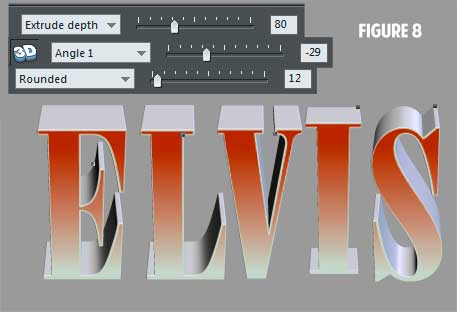
By Default, your first choice on the Extrusion Parameter drop-down list is Extrude Depth: set this to 80. You’re still not going to see much of an effect because the characters aren’t rotated in any of the 3 possible directions.
-
Choose Angle 1 (the top to bottom, somersault Y axis), and set it by using the slider or typing -29 or so. This leans the letters down so you can see their tops as though you have a balcony view of this scene. Finally, set the bevel style to Rounded if it didn’t already offer this to you and choose a subtle amount such as 12. Figure 8 shows you where you should be.
-
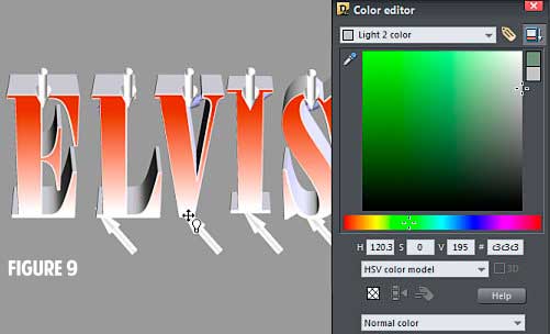
Ah! The white bottoms of the text look a tad dirty; this is because the lighting hasn’t been adjusted yet. Click the lightbulb icon on the Infobar to depress it, and to show these really neat 3D arrows that indicate all three of the light sources on the objects. It’s not awfully germane to this example what color the blue lights are (light 2 color on swatch drop-down list on the Color Editor), but the white (light color 1) should be nearly white, say 10% black in order to brighten up the text. So with the Color Editor (Ctrl+E), scroll up the drop-down swatches list at the top of the palette and then when you find Light Color 1), using HSV color mode, drag the marker in the Saturation/Brightness field up and to the right, as you’ll see in Figure 9.
-
The neat thing about having selected all the individual characters at once is that the lights 1, 2 and 3 for each shape can now be manipulated simply by dragging one around—the other 3 will move in identical fashion. So first, drag any of the light color 1 markers to a position in front of the text, and then move the marker up until you achieve more of an even, brighter lighting on the front face of the letters.
-
Let’s address light 2’s position(s) now. Drag any of them to the bottom of the letters, and then drag up to put them in front of and not behind the letters. When you have an evenly lit set of letters like those shown in Figure 9, stop and you’re finished lighting for a while. We don’t care about light 3 because it won’t make a significant addition to the scene.
It’s time to arrange the text in a partial arc, and this is easier than you’d imagine, except it needs to be a two-stage process. Merely rotating the letters along their X axis won’t produce an aesthetically pleasing effect because the letter shapes are all different, the X rotation is along the center of each character, but moving “wrong” looking characters and actually scaling them up or down is the remedy, so let’s get to it, because The King hasn’t entered the building yet.
-
Pop Quiz: if you’re going to move extruded stuff from left to right, which slider do you choose? Right: Angle 2. So select this angle setting from the Extrusion Parameters drop-down list, and let’s begin by selecting the “L” preceding the “V”, because the “V”, at center of the proposed arc, isn’t going to have any X rotation—it’s the center of the character arc. You want the “L” to lean right toward the “V”, which is a counterclockwise (“anti-clockwise” if you’re not a Central New Yorker!), which means the “L” gets a negative value in the num box next to the slider. Try -16, then hit Enter.
-
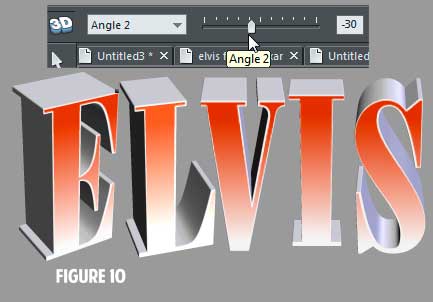
Choose the “E”, and with Angle 2 still chosen, try -30, approximately twice the rotational value of the “L”. The work in progress is shown if Figure 10. Now, because the letters aren’t the same width (such as the “I”) we’re going to need to fuss around with the rotational values of “I” and “S” a little, exactly what value depends on the font you use. Select the character “I”, and because it will lean left, that’s clockwise and therefore a positive rotation angle. Try positive 16, which is the opposite of the “L” but visually, it, appears to work.
-
You can un-depress the light bulb icon for the moment. Zoloft is usually good for curing depression, or just clicking on the icon a second time to un-depress it.
-
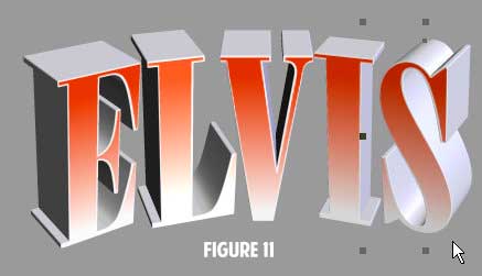
With the “S”, it deserves about a positive 23 rotation angle, probably because it’s much wider than the “I”, and it just looks wrong if you rotate it any farther, as you did with the “E”. Figure 11 shows you both the finished arcing text and how the “E” and the S” needed to be repositioned a little because you really don’t have precision control over an extruded object in 3D space relative to other objects. I have my nudge distance set up in General in Options (Ctrl+Shift+I) tgo one pixel, and used the keyboard arrow keys to nudge the characters into an artistically correct position by tapping the up, down, and the other two arrow keys.
Elvis, you’re Grounded!
Now that you have the letters arranged and lit correctly, let’s give them an imaginary plane to rest upon. You might even want to add an actual plane to the characters, because when Elvis comes on stage in front of those letters, he is likely to fall of the document page unless he can stand on a floor. Let’s get to adding shadows to the lettering to strengthen the suggestion that these are massive prop letters to set the stage for the entertainment.
-
I have a grey background going on in these figures, but that’s only to show the contrast between the foreground characters. You can do this too using the Rectangle tool, and then press Ctrl+B to put it to the back of the letters.
-
Select the “E” and then press Ctrl+F to put it to the front of the page. And I’ll explain why you’re doing this shortly.
-
Do the same as Step 2 with the rest of the characters, working from left to right, so the “S” is now the top character.
-
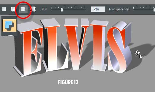
With all the characters selected now, choose the Extrude tool from the Toolbar, and then click the Floor Shadow button on the Infobar. Golly! All the characters have shadows and because you staged the characters in ascending depth order, none of the shadows cross one another, see Figure 12, and by all means, cant the shadows to the right and fuss with the Blur and Transparency slider until you’re happy with the Effect. The background, if you used one, can be deleted now.
Adding Your Star
Open the Elvis.xar file now, copy the silhouette, and then paste it into your lettering composition. This is both the conclusion and the easy part of this scene, as follows:
-
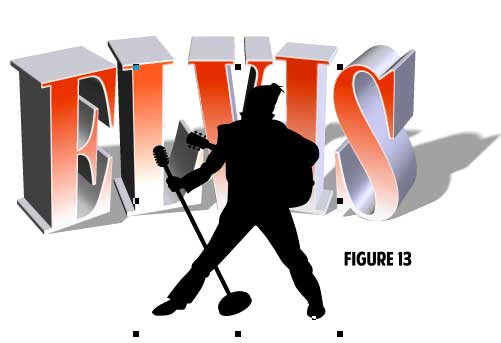
Position Elvis as shown in Figure 13. It was a deliberate design idea to keep the characters medium to light so you have the opportunity to position Elvis in several different positions and the black silhouette offers enough foreground/background contrast to make everything visually legible. So place him in an area in front of the arcing characters where he can be seen n all his glory. Don’t be cruel.
-
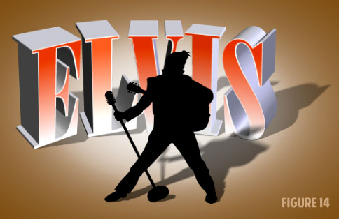
Let’s do the same thing as you did with the character shadows with the silhouette. With the Shadow tool, click the Floor Shadow button on the Infobar, drag the shadow a little down and to the right so it mimics the angle of the text lighting, and as you can see in Figure 14, the scene is fairly complete and we’re ready to listen to “Suspicious Minds.”
Creating the Overwhelming Thriller Headline
If you’re looking back at 40, and especially if you’re a guy, you remember the pulp comic books that cost a whopping dime, and promised on the cover that you’d be transported to the outer rim of our galaxy in a rocket ship shaped like a mustard dispenser with fins, to meet and defeat bug-eyed monsters. 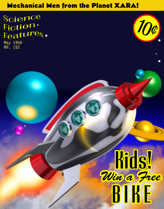 And painstakingly, the cover artist hand drew a swooping, 3D headline, and today this is a relative stroll in the park if you know how to prep a headline before extruding it. That’s the topic of this section, get out Sci-Fi magazine.xar, ad let’s get into a head that promotes splashy, gaudy, and positively breathtaking text. The name of the magazine should have as much over-promise as the cover art, so let’s call it Astounding Adventures.
-
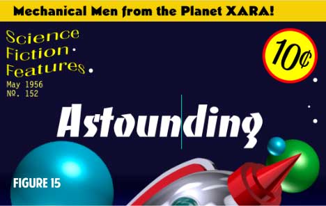
Find a bold, Retro style typeface suitable for a headline. I’m using Banco Heavy, originally designed by Roger Excoffon, and it’s a commercial font costing about $20, but I got it free a million years ago with an early version of CorelDRAW. Bitstream as well as ITC distribute the font, but I’m not asking you to buy it just for the sake of this tutorial. Just surf around and 1001 fonts.com will surely have a knock-off or something in the spirit of Banco for this tute. I’ve typed it out in the vacant position on the comic book cover in Figure 15.
-
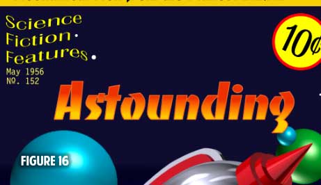
Color the headline, with colors that accent the cover at. I believe a linear gradient from deep red at top to gold at bottom will do the trick, and in anticipation that this will be extruded text, give the text a medium reddish brown 2 pixel outline. This will maske the sides of the extruded shape the same color, and easy to work the lighting of the shape to produce some drama. See Figure 16.
-
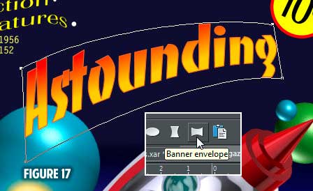
To give the Extrude tool a little something more to work with than perfectly aligned text (yawn), select the headline, choose the Mould tool, scrape a little of the mould off with a butter knife, and then choose the Banner Envelope preset button on the Infobar. Initially, the result is going to look as though you put the text between your thumb and index finger and squeezed. This is not our goal: the Banner type envelope contains two straight sides on left and right, and curved path segments at top and bottom, and you’re going to edit them with the Shape tool.
-
Choose the Shape tool, and then select the top curve, let’s say in the middle. Drag it upwards until the curve leans toward the top of the magazine cover. Now play a little with the Shape tool and the centre of the bottom curve until you have a nice arcing headline.
-
Click on the bottom left control point for the envelope and drag it down and a little to the left so the left side of the headline is larger than the right side. Click the bottom right control point and drag it a little to the right, so overall, the text is a little wider at the bottom than the top. See Figure 17. These steps have just prepped the Extrude tool to create an awesome 3D headline.
-
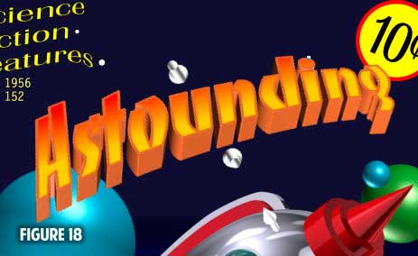
Choose the Extrude tool, and the following steps can be done manually without the need to enter precise values on the Infobar. With the text selected, click the Extrude tool icon on the Toolbar, and then drag upwards on the text so the bottom of the 3D lettering shows. This is “text drama”, and as you can see in Figure 18, I’ve left the lights on and made them almost pure white. You do this, too, using the Color Editor, and give the impression that the lettering is heavily lit from the bottom. In the theater, this is called “emanations from hell”, very powerful and foreboding, like the time you scared the daylights out of your younger sister by entering her room at night with a flashlight pointed under your chin.
-
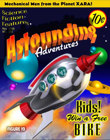
Use the Shadow tool to create a heavy dark wall shadow type shadow, going upwards instead of downwards, and even if it just clips the 10¢ text, you’re reinforcing the supposed malice found between the covers of the mag.
-
You have “Amazing”, and now you need “Adventures”. I suggest contrast here to get dynamics going on and some attention to the title. So the title is large and colorful, with bold straight lettering—you want something soft but powerful to complement the 3D text. I’m going to use Gillies Gothic, designed in 1935 by William Gillies. Good alternatives are Aloha by Diane DiPiazza, which is free at fonts-download.net if you register with them, Glastonbury sort of works and that’s a free font from Fontek, and probably the best alternative is Kaufmann, also called “Diner Script”, and it’s not hard to search and find a knock-off this font, originally designed by Max Kaufman in 1936. Here’s what I came up with in Figure 19. You angle the text a little, tuck it under the 3D’s bottom side, perhaps add an upward traveling shadow, and you now have not a bad sci-fi comic book cover now, eh?
Making 3D paper chains
You’ve al seen an accordion-style piece of paper with repeats of a human figure; this is often called a “paper doll chain” by those who have nothing better to do. Still, the effect of alternative elements is an intriguing one, and the following steps take you how to achieve a 3D effect without the Extrude tool. This is one of those things you can easily do, but might not have thought of…that’s way I’m here:
-
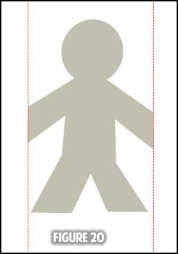
Draw a figure similar to that shown in Figure 20. It’s important that the hands terminate at a perfect vertical so you might want to put a vertical line or two out and use the Shape tool to perfect the design. Horizontal symmetry is important, and you can color your figure a light warm color. You don’t have to follow my “men’s room sign” character perfectly; you can add a simple girl’s hair-do, and make the torso skirt out to make a, um skirt.
-
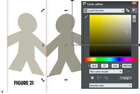
With the Selector tool, select the figure, and then click on it to put it into rotate/skew mode, then use the skew handle at middle right to skew downwards about 9 or 10 degrees; look at the Skew number box on the Infobar if you’re uncertain about the amount you’re dragging.
-
With your skewed character selected, press Ctrl+K to make a duplicate over the original. Move the duplicate to the right and then use the Flip Horizontally button on the Infobar to mirror guy (or gal) #2.
-
Align their arms (where their hands should be). Press Ctrl+E to bring up the Color Editor, click the eyedropper over figure #2, and then using the HSV color model, drag the brightness down a little so figure #2 is darker, but not drastically darker than the original figure, as shown in Figure 21.
-
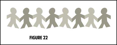
I think you can anticipate this step: you duplicate these two figures several times, make sure they’re horizontally aligned, and make sure their arms are touching. See Figure 22.
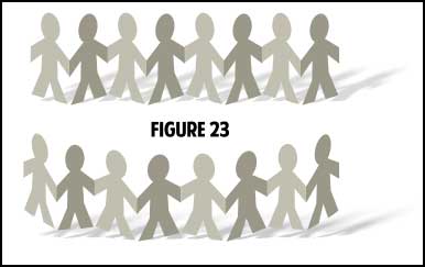
The reason this trick works optically and the figures seem to tilt toward and away from you has to do entirely with alternating colors. One side of the scene is casting light, and every other figure is facing away from the illumination. Other things you can do to enhance the composition is to select all the figures and squish them horizontally to accentuate the accordion illusion. You can also add a floor shadow to your group, being careful to make the transparency a high amount not to compete with the grey figures, as seen in Figure 23. Alternatively, you could add color to the figures. Finally, you can use the Mould tool in the same ode as you did with the Amazing text earlier, to make not just an accordion chain of figures, but one that droops in the center, as if suspended by a string for a party or a gingerbread man charity ball.
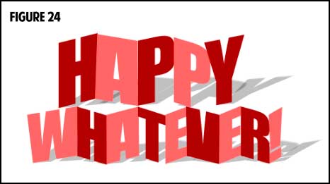
Don’t think “paper doll cutouts” when you use alternative colors and the skew function to make art. You know, in the gift section of almost every store, there’s balloons, unflattering cards for those who have turned 60, and accordion style lettering. If you’re careful, and slice off any side of a character that’s not perfectly vertical, you can make a “Happy Birthday” accordion style chain of text, like that shown in Figure 24.
I hope you benefit from at least some parts of this article, and just remember in design adventures of your own, that the third dimension can be far more expressive than just extruding a line of text. Use scenery to support your visual message, and find unexpected ways to push your elements toward the audience while keeping height and width equally important elements.
Discuss or ask questions about this tutorial in the Xara Xone forum on TalkGraphics.com.

has been drawing with traditional tools for almost 40 years, and with digital tools such as Xara for close to 20. As large a fan as he is a practitioner, Gary encourages others to express themselves artistically through his writing, the over 25 books on graphics he’s had published, through the videos and tutorials he creates for The Xara Xone, and through his online school, Exclamations. You can send him some email, visit his personal website, or better yet drop on over to the Xara Xone Forum on TalkGraphics and talk to Gary and the rest of the Xara community.
The tutorial Going Beyond 3D including the artwork and the downloadable examples file are Copyright © 2014 Gary Bouton. All Rights Reserved.